Quantcast
Channel: Hardwood Floors Archives - Maria Killam | Timeless Colour
Viewing all 93 articles
Browse latest View live

Two Classic White Kitchens To Copy

$
0
0

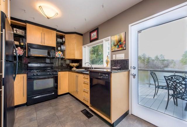
We are finalizing the finishes and colours for Crystal’s white kitchen (see the before pics here). These are the two options we discussed.

Option 1

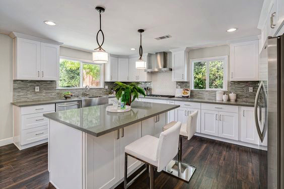
Marble looking quartz with off-white cabinets and a walnut island with light floors (rift white oak), here are some inspiration pics.
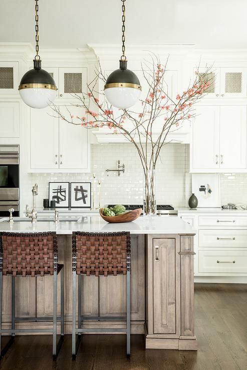
Two Classic White Kitchens To Copy

Via DecorPad

This floor is darker than what we are installing but this is the idea (above).
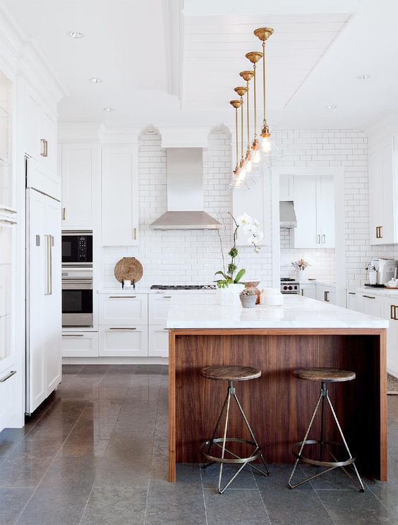
Two Classic White Kitchens To Copy | Maria Killam

via Pinterest

We are installing hardwood floors (NOT REMOTELY GREY TILE) but the rest of this kitchen fits into option 1.

Here’s another lovely stained island and white kitchen but what do you say about the tile (above)? What is happening in comparison to the white kitchen? And what’s the neutral undertone of the floor tile? Leave your assessment in the comments.
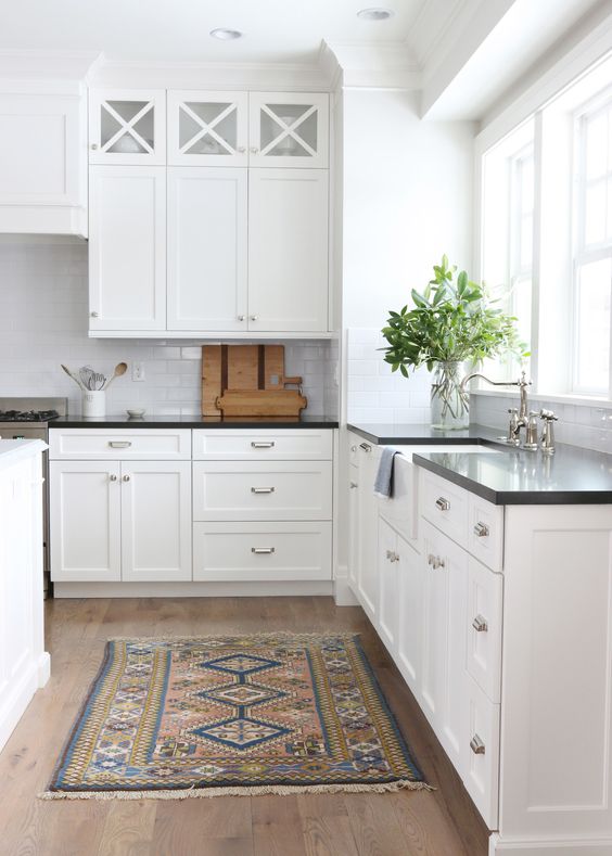
Option 2

Absolute black countertops, true-white cabinets and rift white oak hardwood floors.
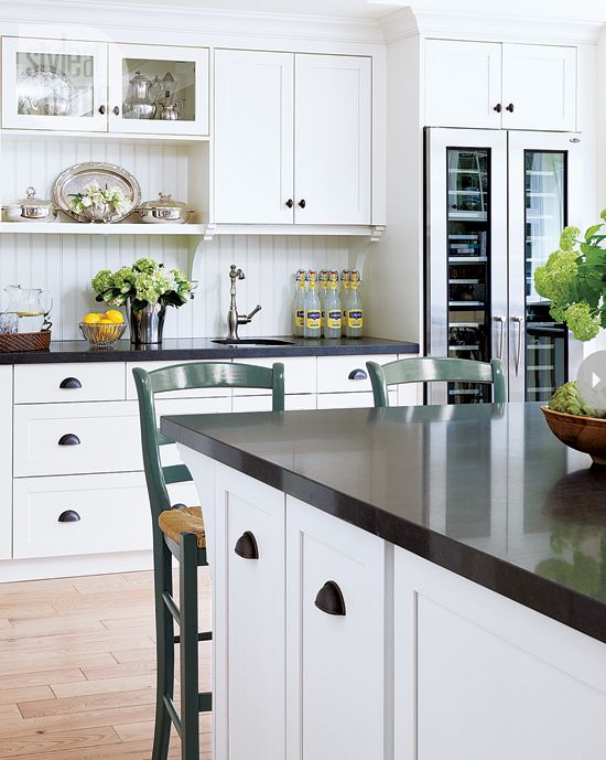
Two Classic White Kitchens To Copy | Maria Killam

via Style at Home

Two Classic White Kitchens To Copy | Maria Killam

Via Studio McGee

Two Classic White Kitchens To Copy | Maria Killam

Via Luxe

Which would you choose? Crystal likes the black countertops because she thinks it adds a more masculine element to a white kitchen so that’s what we’re doing.

The last three kitchens don’t have any grey in the flooring making them classic because you can’t identify the trend in which they were installed.

Terreeia and I are in Cabo for 10 days, and we brought my Mom, she’s never been to Mexico so she’s excited (and isn’t my wifey generous to allow my Mom to come along 😉

After doing two events almost in a row in Vancouver and Dallas, we are ready for some rest and relaxation!

Two Classic White Kitchens To Copy | Maria Killam

Photo by Maria Killam

Tracey emailed me this note with her review of the Vancouver course in February:

“Thank you Maria and team for a fantastic course in Vancouver!! Love, love that through your course I now feel confident to articulate my design choices, together with the visual component of your colour boards, to ensure the client has clarity on both the design process itself and on the value of the design services provided.

This course has reignited my passion for interior design and especially the “business” of interior design. Thank you!” Tracey Menchions Design

Don’t forget to weigh in on the colours in that second kitchen and which kitchen you would choose!

If you would like to transform the way you see colour, become a True Colour Expert.

If you would like your home to fill you with happiness every time you walk in, contact us! We would love to help you choose colours, select the right combination of hard finishes or create a plan to pull your room together. You can find our fabulous e-design consultation packages here.

Related posts:

Interesting to Classic Kitchen Counter and Backsplash Makeover

White Kitchen Cabinets for the Most Timeless Kitchen

Ask Maria: Help! I Don’t Want the Same Kitchen as Everyone Else!

The post Two Classic White Kitchens To Copy appeared first on Maria Killam.


Sell Your Classic House in 24 Hours Flat

$
0
0

When Terreeia and I were in Toronto for my Specify Colour with Confidence™ Event in May, we had dinner with a good friend.

We were talking about the extremely hot real estate market in Toronto (and Vancouver). In the last two weeks for example, homes in Toronto are selling for up to a million dollars OVER the asking price with bidding wars everywhere.

Terreeia’s friend had her condo up for sale in Toronto in a prime downtown location. It had been on the market since December and she had not received a single offer.

I asked to see it, so she pulled it up on her phone, laughed and said “It’s probably a good example of ‘what not to do'”.

I flipped through the images and replied, “I can tell you exactly why it’s not selling”.

“The entire place is 90s, the cabinets are a ginger, orange stained wood, the floor tile and unfortunate backsplash are in varying shades of sage green (everyone had a sage green sofa in the 90’s, because that was the neutral of the moment) and the bathrooms are the same. The walls are painted a strong yellow beige which is also dated.

If you want to sell your condo now and not drop your price even more, you need to paint the cabinets white and at the very least, change out the backsplash as well as paint the entire place greige. Also, you have two screaming pink beige love seats which are very bad with the yellow beige walls. I would add white slipcovers to go with the black and white zebra rug you have in the living room.”

There’s a reason why good stagers are worth their weight in gold. Most people don’t want a DIY project, and they can’t visualize how even just a coat of fresh paint can completely transform an interior. Her condo was not even in the tuscan brown trend, it was from the era before that, making it an even harder sell.

Terreeia’s friend was moving to Arizona with her new boyfriend. She was there the following week looking at rentals and she messaged Terreeia saying “Everything down here is BROWN. I was going to keep my furniture before Maria’s assessment, now I’m leaving it in Toronto, but they sure need Maria here, haha”.

What most builders do not understand is that it’s mostly the female who makes the decision on the house. It’s the wife, who turns to her husband and says “Honey, this is the house/kitchen that I want”. A man lives to make his woman happy after all.

Now, lets flip over to the Vancouver market where I recently heard this story. A realtor was driving around with his client and the client said “This is too slow, we need a helicopter. They flew around and saw 11 properties. When they landed, the realtor turned to his client and said “Which one do you want?” The client said “I’ll take them all”.

The couple who bought Katey’s house (below) were living closer to the city in an apartment with two small children. It was the husbands dream to buy a house for his wife and family and they bought it without even seeing it in person. The wife cried tears of joy when she came to visit for the first time after their successful purchase.

Katey had found my blog right before they moved in and AFTER the major renovation had happened, which included the bathroom (below). But she made all the right colour decisions after that.

Katey and her husband had no trouble selling their house.

kateyblueexterior

After Front Door: Behr Ocean, Exterior Cloverdale Sharkskin solid stain in Blueprint

kateybeforeexterior

Before


Maria Killam Sell Your Classic House 7

Katey and her husband’s dream is to live on acreage. They had recently put an offer on a property they had found subject to selling their house and lost it. When they found the next one, they bought it without subjects and then were anxious to sell their house.

They did not need to worry. With the fresh look and feel Katey had created with just two consultations with me, she had multiple offers with realtors knocking on her door making personal pleas on behalf of their clients including letters and photos of their families.

24 hours later, their house was SOLD.

kateykitchenbefore

Katey’s handy husband did all the renovations himself.

Maria Killam Sell Your Classic House 2

Kitchen after

Maria Killam Sell Your Classic House 3


kitchenview

kateybeforedining

Maria Killam Sell Your Classic House 4

Dining room after

kateybeforeliving

Maria Killam Sell Your Classic House 10

Walls BM Classic Grey, all Trim & Cabinets SW Snowbound

kateysbathroom

This is the bathroom she renovated prior to finding my blog so it’s a little earthier than it would have been otherwise, however the finishes do coordinate which is nice.

The cabinet was existing and it was a wood stain, Katey’s husband did not want it painted so she did it one day when he was at work and when he came home he agreed that it looked better.

Maria Killam Sell Your Classic House 8

The backyard the new family will enjoy.

katey

This is Katey and her happy husband!

Even in a hot real estate market your house can sit around if the finishes are too personal and trendy. Remember, boring equals timeless. Keep this mantra in your head when you renovate or build your house and you will be much happier in the long run!

If you need help creating a fresh look and feel for your house, use our exterior or interior consultations.

Related posts:

The Best Cream Bathrooms

The Best White Bathrooms

White Kitchen Cabinets for the Most Timeless Kitchen

The post Sell Your Classic House in 24 Hours Flat appeared first on Maria Killam.

The Stunning and Classic Home of the Giannetti’s at Patina Farm

$
0
0

The Stunning & Classic Home of the Giannetti's at Patina Farm | Maria Killam

Roses from Brooke’s garden to greet us in the guest house

Many of us in blogland followed Brooke and Steve Giannetti when they built their dream home in Ojai, California and moved from their previous house in Santa Monica.

They have lived there now for three years since it was finished, but in the Spring of 2014, Brooke posted photos of her gardens here, only one year after it was installed. I kept this post open on one of the tabs on my laptop for weeks afterwards.

It was easier to click once and gaze at her gardens whenever I needed to feel peaceful.

The Stunning and Classic Home of the Giannetti's at Patina Farm | Maria Killam

Photo by Brooke Giannetti

Then I scheduled one of my colour training workshops in Los Angeles last month so I contacted Brooke and asked if I could come by, see her place and review her book. Brooke and I started our blogs at the same time in 2008.

She immediately responded with an invitation to stay in her guest house (below). I said, Hmmm. . . let me check my schedule, haha, YES.

The Stunning and Classic Home of the Giannetti's at Patina Farm | Maria Killam

Guest house at Patina Farm

This was where we spent the night, it’s positioned in front of their lovely pond.

The Stunning and Classic Home of the Giannetti's at Patina Farm | Maria Killam

Photo by Maria

These were the very rusty and awesome upholstered outdoor chairs right outside our window in the guest house.

The Stunning and Classic Home of the Giannetti's at Patina Farm | Maria Killam

And here was our view from the guest house in the morning.

The Stunning and Classic Home of the Giannetti's at Patina Farm | Maria Killam

This was a photo of the same pond styled for their beautiful book, Patina Farm.

Here’s what makes this house so classic and timeless. There is no tile or stone anywhere except the limestone floors which transition almost seamlessly with the white oak floors.

There’s very little tile or stone out there that doesn’t eventually date.

Notice there is not a stitch of grey or charcoal anywhere (below). Installing hardwood floors with grey in them will instantly place your new build or renovation inside the grey trend.

And, I know it’s hard to find pre-made flooring WITHOUT grey in it, so a little is okay.

Here’s how you know the floor you’re considering might be too grey: If the overall read of your floors are grey, then they are most likely too grey, but if the overall read is pale yellow or medium brown first, that’s how you know you’re on the right track.

Related post: The New Timeless Hardwood Floor

The Stunning and Classic Home of the Giannetti's at Patina Farm | Maria Killam

Transition between the white oak floors and limestone in the guest house.

The Stunning and Classic Home of the Giannetti's at Patina Farm | Maria Killam

I didn’t take a picture of the shower in the guest house so here’s a picture of Brooke and Steve’s bathroom renovation in Oxnard.

Notice the absence of wall tile here in any trendy shape or form. Nothing trendy to worry about because it’s only on the floor.

So if you’re stressing about which shower tile to choose for your shower walls and you don’t have this kind of house so plaster walls aren’t going to cut it?

That’s where white or cream subway tile comes in. Simple, clean, always a classic. There is simply no reason why your bathroom needs to have all the latest tile trends combined.

Related post: Ask Maria: What’s Next After Subway Tile

The Stunning and Classic Home of the Giannetti's at Patina Farm | Maria Killam

This is Brooke and Steve’s view from their kitchen sink.

The Stunning and Classic Home of the Giannetti's at Patina Farm | Maria Killam

The Dining Room

The Stunning and Classic Home of the Giannetti's at Patina Farm | Maria Killam

Brooke’s office is connected to this vegetable garden where some of her chickens hang out!

The Stunning and Classic Home of the Giannetti's at Patina Farm | Maria Killam

Photo by Maria Killam

Brooke says every Tuesday the gardeners put the dirt back in the garden beds that the chickens kick out all day long, haha. Look there’s two of them settled into the holes they’ve dug (above).

 The Stunning and Classic Home of the Giannetti's at Patina Farm | Maria Killam

I took this photo of Brooke’s olive tree in her living room. She said it doesn’t really like it inside but for $75, it’s easy to replace every 6 months if necessary. Adding this kind of greenery inside really adds to the ethereal look and feel of any interior.

The light on the right is coming through the hallway to the kids bedroom wing (below):

The Stunning and Classic Home of the Giannetti's at Patina Farm | Maria Killam

Hallway to the kids bedroom wing. Photo as styled for Patina Farm

The Stunning and Classic Home of the Giannetti's at Patina Farm | Maria Killam

This is how it looks the day I took the photo. I love the mushrooms! A decorator never stops decorating, things are always changing!

The Stunning and Classic Home of the Giannetti's at Patina Farm | Maria Killam

Years ago I had a reader contact me because she wanted me to help her add some ‘colour me happy’ to her master bedroom. Inspired by Brooke’s neutral aesthetic, she had used linen throughout. The headboard, all the bedding and a wall of windows was covered in the same (pink) beige linen fabric.

What was missing from her decor was Patina. The old and worn decor in cognac and medium brown shades that add depth and interest.

So if you have decorated your entire home in shades of grey and feel that something is missing, this is what you need to add.

And you’ll need Brooke and Steve’s book Patina Farm to help you with that, get it here. Study the pages of their interiors, get transported and inspired to add some old and vintage to your decor.

patinafarm

My signed copy is in the family room. With an oak leaf I brought home from their garden.

Thanks again Brooke and Steve for inviting us into your home, we loved every minute of our short stay!

mariacharlotte

Maria Killam

I’m at the airport in Charlotte on my way home from Fall High Point Market. This is my happy face because I’m going home, hooray! Stay tuned for my 2017 trends post next.

Related posts:

Add Some Fall To Your Living Room Using Brown (I did)

First Rule of Design: Boring Now Equals Timeless Later

The Minimalist Guide to Decorating with Charcoal

The post The Stunning and Classic Home of the Giannetti’s at Patina Farm appeared first on Maria Killam.

How to Transform a Charcoal Sofa with Colour: Before & After

$
0
0

Shari and her husband couldn’t agree on a ‘colour’ when they went shopping for a new sofa, so they chose charcoal.

The reason why they couldn’t agree on a colour, is because choosing a sofa BEFORE the carpet, artwork or throw pillows is like picking all the paint colours for your house BEFORE you buy a stick of furniture.

If you don’t have an inspiration starting point, then it’s much harder to make decisions on paint or furniture.

And the reason why most people ignore this advice and just pick colours or a sofa ANYWAY is mostly because if decorating is not your gift, choosing an area rug or a throw pillow, might be even harder than just buying a new sofa.

Tell me if I’m right? This is just MY theory.

Shari had been following my blog for a while and she sent me a note asking if I could help.  Since she lives almost across the street from me, I popped over to take a look.

Her husband made their coffee table out of a slab of wood. It adds a nice touch of warmth to the space.

Also the other thing they did right was they didn’t just buy a set of matching coffee tables. A collected look is always better than three matching coffee tables (same goes for your bedroom).

The medium brown floors are also just right. Timeless and classic.

Shari has a daycare business in her home in Yarrow. She has two of her own children, 7 and 11, and during the week she’ll have up to 7 children in her home ranging from 11 months to 9 years old.

She needed a carpet that could get dirty and not immediately show everything. I suggested yellow or white curtains to replace the grey ones, but Shari said the charcoal colour worked better for room darkening if the TV was on during the day.

I said if all she needed was a carpet, pillows and some accessories, we could do that kind of transformation in just one day, with a single trip to HomeSense.

I snapped a picture of the existing artwork, grabbed a sofa cushion and three and a half hours later, this was the result:

We choose the art with the red umbrella to coordinate with the existing art work, this made the wall look more finished. The area rug, eight new pillows, a basket for throws, some vases, purple books for the coffee table, and some smaller, more interesting shaped frames, all this for a little under $1000.

When you buy an area rug to coordinate with YOUR charcoal sofa, DO NOT buy the matching charcoal shag from Costco. You need to ALTERNATE the contrast. A dark grey rug would have died in here with the sofa.

The drapes should also be a colour or white (off-white or cream) but as already mentioned, Shari says the charcoal drapes block out the sun more effectively.

Anytime you see a tear-shaped vase, pick it up. You need so few flowers to add a splash of colour to any vignette. Make sure all your frames are NOT the same size, you need a variety of sizes to turn them into an accessory.

These frames hold photos of her 9 year old son Tyson, the football star!

Also, notice that I added some coffee table books underneath the lamp to give it a little more height. A trick anyone can use.

Shari’s end table was already just right for the space. But the first thing I did with the sectional was move it 4″ away from the wall. Give your furniture some space to breathe! It also allowed the curtains to hang freely.

Before

We repeated the marigold colour on the other side of the room in the vase.

The organic coffee table adds texture and warmth.

I photoshopped the charcoal drapes so you could see how the room looks with white.

And here they are in the marigold shade

Here’s the before again:

And here’s the after again:

Which drapes do you prefer? The charcoal, white or gold?  Let me know in the comments!

I like the purple in this colour scheme because it feels trendy and current. Pinks and purples are coming on trend big time, because they feel newer than some of the blues and greens and oranges we’ve been decorating with for a long time.

Maria & Shari

When I arrived on Sunday to take photos Shari said, “I wish I had video taped my daughters reaction for you when she walked in the door, she shrieked with joy and started rolling around on the rug”.

That’s what happens when you suddenly have a look and a feel.

Later, Shari sent me this note:

Being a huge fan of your blog and your work, I was still so amazed at how quickly you chose different colours for everything we bought that day and how they all just worked. I am so very grateful. You made my cold living room into a cozy and beautiful room for my family. Thank you!

If you live in the lower mainland, and would like a one day transformation, contact me here.

If you need an eDesign transformation, you can purchase our ‘Get me Started’ package here.

My very first business before I fell in love with colour was called One Day Design. Transforming an interior in just one day with a little styling is still my absolute favourite thing to do!

Don’t forget to let me know which colour drapes are your favourite!

I leave for my Austin Specify Colour with Confidence event in exactly one week, I’m excited! It’s much warmer there than it is here right now!

Related posts:

How NOT to Choose Paint Colours; But Everybody Does It

How to Coordinate Coffee & Accent Tables like a Designer

Four Ways to Decorate around Your Charcoal Sofa

The post How to Transform a Charcoal Sofa with Colour: Before & After appeared first on Maria Killam - The True Colour Expert.

How to Avoid the 5 Most Common Kitchen Mistakes

$
0
0

I’m travelling and leading my first, SOLD OUT Specify Colour with Confidence workshop in Chicago this week. The second one in Chicago is next weekend, we are ALMOST sold out but have 2 spaces left if you have time to jump in. Register here.

Tricia Firmaniuk, my fabulous Virtual Design Assistant, wrote this great post about kitchens. Let me know what you think!

______________________________________________________________

Here’s a kitchen I found listed on Zillow that has clearly been recently renovated.

And while the outcome is not terrible, I don’t think you will find this kitchen popping up all over Pinterest.

So I thought we could pick it apart, not to be critical or mean, but because this is such a common scenario, and then we can gain some useful insight into why so many renovations fall a little short of expectations.

Contemporary Kitchen with Emser Tile Lucente Random Sized Glass and Stone Glossy Mosaic in Grazia Linear, Pendant Light:

From Zillow

First, let’s talk about the use of pink beige walls. Wha?? It would make sense if you were working with a bossy pink beige travertine tile for example, but why introduce pink beige here at all? Maybe the adjoining room dictates pink beige, in which case the kitchen should never have been gray.

What I see at play here are several of the mistakes that we see frequently leading homeowners astray when they tackle DIY renovations:

  1. Worrying about a white kitchen being cold

This is a big one. We hear this concern often from our eDesign clients, so let’s get into it.

It’s likely that the wall colour choice is an attempt to “warm up” a white and gray kitchen. This is one of the perils of thinking of colours in terms of absolute “warm” and “cool”, rather than in terms of distinct undertones.

If you look at this kitchen through the lens of Understanding Undertones, you can easily see that the pink beige walls don’t relate at all.

First, if you’re installing a wood floor (NOT a blotchy wood look tile like they have here), your kitchen will have plenty of WARMTH with a wood floor.  White and wood is a magically balanced combination, white is crisp, bright and airy and wood is warm, patterned and grounded and best of all mostly NEUTRAL.

The floor tile here unfortunately is a good example of what not to choose when shopping for a wood look tile.

Something much less busy and more solid would have been much prettier and more convincing. It’s a common pitfall to fall in love with the more “interesting” looking small samples with seductive variations in tone and colour, but once you install it wall to wall, those patterns become repetitive and busy, not pretty at all. A quieter tile here would have given this kitchen the “warmth” of a wood floor.

The reason Maria so wholeheartedly promotes white kitchens is that they are timeless (even if they also happen to be trendy at the moment). The idea is to create a neutral and classic, white and wood backdrop so that you can get creative with decorating and styling, changing it up as frequently as you like for years to come.

Here’s a white kitchen that is beautifully styled (below) with natural finish cane backed bar stools and pretty gold pendants.

Related post: Ask Maria: Will my White Kitchen be Cold?

Victoria Hagan via Elle Decor

2. Trying to match hard finishes and paint colours to your wood floor.

This is a classic rookie mistake. It’s possible that they felt they needed to coordinate the paint colour with the “wood” floor here. However, your wood tone is RARELY a major consideration when choosing a COLOUR for your interior.

This is so common. When faced with choosing colour and with not much else yet in place to consider, people often default to fretting over their wood colour to inform their choices. When really, you need to make some decisions about decorating and the look and feel of the space to inform your colour choices, not look to the wood.

It’s like asking the grass what colour your flowers should be.

Let’s take a moment to get our dopamine levels up by looking at some gorgeous kitchens where the wood floor appears to be ignored in the other fixed elements to glorious effect.

©MandyOliver2015 for Nicole Davis

From Nicole Davis Interiors

In this kitchen above, the designer has used pretty wood stools and cutting boards to bring a bit of “warmth” into this white kitchen. NOT beige quartz, tile or paint.

From Coastal Style Blogspot

Here’s a creative way to add warm wood to a modern white kitchen, a large vintage surfboard!

Imagine sitting down with the little sample of solid white quartz and a sample flat panel glossy white cabinet. You might be worried about it being “cold” or boring right? This is why you need to have the end result in mind. It’s easy to imagine panicking and picking out some “more interesting” busy, bossy countertop material at the last minute, losing the powerful simplicity and restraint of this design.

3. Installing a trendy backsplash

How do we all feel about the backsplash in our specimen kitchen?

Since pencil mosaic is no longer the backsplash heart throb of the moment, it reads as not being very current. It’s pattern competes with the  busy, stripey floor in an unpleasant way, and if we want to get super picky, it is a bit too blue for the green gray quartz on the perimeter cabinets.

Now we have pink beige walls, green gray quartz and blue gray backsplash tile. Hmmm, that’s three undertones plus white and wood. The wall colour really needs to pick a lane here. I think I would go with a pale blue gray like BM Horizon OC 53 because look at how the choppy this feels with the pink beige meeting with the blue gray of the tile and the white of the cabinets.

Here is how the kitchen would look with blue gray walls BM Horizon OC 53

And this is the problem with installing a backsplash in any other colour than white, you have now chosen a PERMANENT wall colour FOREVER.

Matching the backsplash to the countertop is another common mistake. Your backsplash will look much better blending with the cabinets and walls on the vertical plane where it interacts more than with the little strip of countertop.

Which brings me to another often missed consideration in kitchen design in general.

4. Not Managing Contrast and Transitions

See how there is an awkward little pink beige upside down U shape framing each window? Wouldn’t it be better to run the backsplash all the way up to avoid drawing attention to these silly floating shapes by painting them a contrasting colour? Or, the walls could coordinate with the cabinets or the backsplash to eliminate some transitions here.

Even better, install a white backsplash and it will blend seamlessly with the cabinets and window frames and eliminate a whole whack of awkward transitions here.

Here it is with a white backsplash, prettier right?

A white backsplash is not ALWAYS  the answer.

In some contemporary, high end kitchens, the designer might intend for the backsplash to read visually as a continuation of the floor or countertops for a custom look. Like in this glamorous, masculine kitchen below.

46 Marvelous Designs of Masculine Kitchen

But in the average transitional home, a white backsplash is the most classic and goof proof choice because it blends with the cabinets which are the other vertical element in the design, so you don’t have to manage the shapes it will carve out of your space and be a brilliant layout whiz to make it work, see?

A dark or mid-tone backsplash in a white kitchen will always create some Tetris like shape action, and you’d better know if it’s a shape you want if you consider going that route.

Image result for tetris

How fun is this analogue wooden block Tetris set! via The University of Oxford

Anywhere you create contrast you draw the eye. If you create soft transitions by keeping elements the same colour, you eliminate a lot of unnecessary visual noise. A well composed space uses contrast deliberately to direct attention to focal points and create balance.

Glossy tiles -- basic subway tile in a herringbone pattern -- cover the entire wall behind the vent hood for a high-impact, low-maintenance backsplash.:

From Better Homes and Gardens

So, I don’t know about you, but since this is a real estate listing, yes, I might buy this house if if met my needs despite the cosmetic issues in the kitchen and immediately change the backsplash, paint, and floor, (or maybe not, it could get expensive), but for the same amount of money or less even, this kitchen could have been so much more classic and appealing.

Which brings me to the final critical mistake homeowners make when they renovate their kitchens.

5. Not getting professional help

Kitchen renovations are not cheap and mistakes are expensive. If you don’t design kitchens all day long, it’s much too easy to fall into the mistakes of inexperience. And you probably don’t know where to start and what comes first and then next and why. And that’s totally fine, because hopefully you only have to do it once!

So hire someone to figure out the best layout and functionality for your kitchen rather than wasting space, and take advantage of our convenient eDesign consultations to make sure the undertones of your finishes and colours are perfectly coordinated for the most classic look possible for your kitchen here.

If you need help determining which package is right for your needs, email us here.

Thanks Tricia for this fabulous and helpful post!

We’re in Chicago this week and next and I’m excited to explore in between our two courses here!

Okay which tip are you taking with you today?

Related posts:

The Right way (And the Wrong Way) to Install Porcelain Wood Floors

5 Steps to a Kitchen You Will Love

Selecting your Kitchen or Bath Backsplash: Accent Tile or Not?

The post How to Avoid the 5 Most Common Kitchen Mistakes appeared first on Maria Killam - The True Colour Expert.

Ask Maria: What’s Next After the Grey Trend?

$
0
0

Lately I have been getting many emails from readers asking questions like this:

Maria, what comes next??? If we are nearing the end of the gray and white “fresh” trend. What’s next!!??? I’m starting the process of updating a 1990 normal sized (1800sf) house – nothing touched since built in 1994. 

I don’t want to spend all this money and end up with a dated house in a year.

Thanks!!!

Again, if you have recently re-modeled or built a house and you aren’t in love with the result? Well, you should just skip this post because if you read it, you’ll understand why and sometimes I just think, ignorance is bliss.

I have been in the colour industry for 20 years. This means I started specifying colour at the end of the 90s when sage green was the ‘trendy neutral’ of choice.

Then in 2002,  chocolate brown and blue came along. The brown trend was over at the beginning of the 2000s but builders are still–as we speak–installing espresso kitchens because most builders are men and men perceive wood to be more valuable than a white kitchen.

I started talking about grey in 2009 when I started writing this blog. Grey is still going strong but it’s been 7-8 years now.

A trend has a shelf life of about 10 years which is quite different from a fad which is very short lived.

An example of a fad is backsplash tile.

Since I have started writing this blog, backsplash/accent tile fads have come and gone about 4 or 5 times. The current Encaustic tile trend will be just as short-lived as every other trendy tile that has arrived on the scene.

Last Fall when I attended Maison and Objet in Paris, black was everywhere.

I’m seeing more and more black bathrooms, black tile and black exteriors.

So let’s go back to the late 90s for a second.

Sage green was the sofa, tile and exterior default neutral.

Kitchen | Sofa| Sage green exterior

If you still have a sofa from the 90s, it’s most likely sage green. Many of you have bathrooms filled from top to bottom with sage green slate. If you have not painted your house since the 90s, it’s probably a shade of sage green.

And of course, fast forward to 2002 when the Tuscan brown trend arrived on the scene. I was looking for brown and blue fabric about two years before the fabric companies caught up to this trend.

Bathroom  | Brown exterior

Then in 2009, I started talking about the Grey (fresh, clean colours) trend, just a year into blogging.

When clients ask me to specify charcoal for their exterior or for a sofa, sometimes I’ve been known to say “But why aren’t you asking me for brown?”

“Because I don’t like brown”, they would reply.

That’s right, because that trend is OVER. Just a few short years ago, you would have wanted brown.

This is exactly why you shouldn’t paint your house charcoal or install a charcoal kitchen unless you have lots of money and can change it out as soon as you’re bored, which will happen as soon as the trend is REALLY over.

It’s on the fringe of being over already.

Bathroom | Charcoal exterior

Here’s the thing.

There’s nothing wrong with a little bit of sage green, I just got a new book from one of my designer fabric sources and it’s full of mossy green fabrics.

When was this decorated? Hard to know. It’s not brown from top to bottom (and it’s still pretty brown). Miles Redd

There’s nothing wrong with brown either (above). When the brown trend arrived, people said “I love it! Just like every room needs a hit of black, this is the same but warmer”.

In April, I mentioned that my fabric rep had arrived with some brown fabric books. Does this mean that brown is back? No, it’s a book full of brown and grey patterns so that if someone has a brown sofa, they can introduce grey with a fabric and tie it all together.

However, is the planet going to go back to installing brown kitchens and brown tile and painting their exterior brown anytime soon?

NO.

You’re still going to have brown tones in your case goods. If you go with the washed and distressed grey look it will also look dated very quickly. In addition to all the sleek and solid espresso brown furniture and brown leather parsons chairs that are now dated. A little of any of these trendy items works because your house won’t scream ‘Decorated in the ______trend’.

The reason the grey trend arrived is because colour was moving back to the 50s and 60s. Brighter and cleaner. Grey is the crisp backdrop to brighter colour as I’ve said time and time again.

source

Nothing wrong with a little bit of grey. Paint your white or cream (or black and white) bathroom (below) or dining room charcoal (above) to get your grey fix, just don’t choose grey blindly, over and over again with each colour decision you have to make.


source

Okay, are you depressed yet?

I’m not trying to upset those of you who feel you have too much of any of these neutrals, but the thing you should notice is that IF you are upset, it’s because what I’m saying rings close to the truth.

What do you do if you have missed all these trends and are renovating or building your new home now?

Does it help you to know that black is the new grey?

NO. Because the answer to colour decisions while renovating or building your new house is still not going to be BLACK.

Maria’s white kitchen | Maria’s living room | Exterior

All the classic and timeless colours I constantly talk about on this blog still apply just like they did 9 years ago when I started writing this blog:

1. Medium brown or pale wood hardwood floors.

2. White (or cream) kitchens (because you can change out your colours every 6 months if you want)

3. Cream (or white) bathrooms. (go back to number 2) and because the next homeowner then won’t have to rip our your very personal and trendy choices, immediately.

4. A sofa in your favourite colour. (my yellow sofa (above) is 7 years old and still awesome)

5. Silver (combined with easy to switch out items in gold like lighting and hardware)

6. One pattern in hard finishes like tile and countertops is the quota for each room.

7. Keep the patterns in your permanent finishes quiet.

8. Simple mantels in a modern or traditional style but without the usual trendy stacked stone (because the colour will surely dictate your palette forever.

I could go on and on of course but I think I’ve hit the most important areas for this post today! And hey, it’s just my opinion, doesn’t mean it’s right. Take whatever advice works for you and throw the rest out the window! A little styling goes a long way if you ended up with a space you don’t love.

I would have loved it if someone had told me that buying a leather forest green sofa and loveseat back when I was a newlywed in the 80s was totally trendy. Back then, I was convinced it was a totally classic and timeless decision.

My last advice is before you start making decisions on the most expensive purchases most people will make in their lives, hire a professional. Check out our eDesign services here or find someone local to hold your hand. Interview your designer to make sure you get someone who has a classic and timeless aesthetic, I don’t want this to happen to you.

If you are a design professional and are interested in learning about trends, colour and discovering how to design your clients homes from a classic and timeless aesthetic, spend three days with me this Fall in a workshop near you.

Related posts:

How to be Smart in a World of Dumb Designers

Bad Design Advice: Fall in Love With All Your Finishes

Is Black the new Grey? Trends from Maison & Objet

One more Reason you Should Skip Accent Tiles Altogether

The post Ask Maria: What’s Next After the Grey Trend? appeared first on Maria Killam - The True Colour Expert.

The Great Kitchen Contract Hoax (Do NOT make This Mistake)

$
0
0

My neighbour Shari and her husband Josh renovated their kitchen this past Spring.  They chose someone who came highly referred by their friends. He had installed two kitchens for them and they were beautiful.

This is the note I received from Shari:

“We went to Home Depot and a few other kitchen stores but decided to go with him since we saw his work in our friends home.

We paid the first half of what was owing for the completed kitchen. His contract stated that we were to pay half upfront, and the final half was due upon delivery and in our minds completion of the kitchen.

On the day of the installation, he arrived with a young employee and installed most of the kitchen in under four hours. All that was missing was the doors.

After he left Josh and I took a look at his work and were dismayed to find all the chips and damage. The fridge panel was crooked. (below) He cut part of the crown moulding too short and just patched in a one-inch piece to hide it. etc.

We emailed him right away listing the imperfections and he said ‘Don’t worry we are not done’. He was coming back to fix it and put the doors on. He told us to keep our check-measure appointment with the countertop company to keep it all moving and on schedule.

The counter guy arrived and said he couldn’t measure them since the fridge panel was installed incorrectly. 

A few days later two young employees showed up and put up the doors and handles. Every handle was crooked. They filled the chips and holes and left. Josh emailed the kitchen guy right away with pictures and a detailed list of all deficiencies.

A week later the kitchen contractor messaged Josh to confirm he was coming back that day and requested that the final payment was waiting for him.

Josh declined and responded, ‘When we are sure the problems are corrected we will cut you a cheque the same day’. The kitchen guy refused and said he would not come back to do any more work. He noted that the contract stated that final payment was due upon delivery.  He told us he could have delivered the kitchen in boxes and the payment would have been due.

We consulted with a lawyer and she confirmed that according to the way the contract was written, we had no choice but to pay him what we owed.  After that, he came back and fixed the crooked handles and patched a few holes but obviously, the gables remained, given the kitchen would have had to be entirely disassembled to move them.

We have a friend who is a contractor who gave us some advice and helped with a few little things. The rest we have just had to live with. It would have cost an additional $3000 in repairs.

The lawyer said that the contract should have said “Final payment due upon completion of the installation”.

I’m telling you this story so you can also make this adjustment to a contract when you plan your kitchen or bathroom renovation.

I asked Shari if I could style her kitchen and post this story on the blog to save anyone else from going through this.

I’ll also share the other thing I learned from renovating my three bathrooms this summer, at the end of this post.

First, here’s Shari’s new kitchen. She had been following my blog and decided that her small kitchen would be best in white-on-white.

They had lived in the house for 12 years and eight years ago they stained their oak cabinets brown (below).

Shari and Josh already had medium brown hardwood floors in their house (see their living room in this post) and I told them to continue the same floors into their kitchen and dining room.

They did not have more of the same floors they had installed in their living room and hallway so they took a sample and went to every single flooring store in the lower mainland but could not find anything close.

So they ordered tons of samples from online stores and finally found this one in California. They paid more for shipping, but in the end it was an almost perfect match!

I was so impressed, I did not notice they were different at all!

Shari liked the white beveled subway tile so that’s what they installed along with off-white quartz countertops.

Just in case you think all my styling ideas come from the clear blue sky, they don’t. When I was thinking about what I would bring (or buy) to style Shari’s kitchen, I was reviewing my ‘Kitchens and bathroom styling’ Pinterest board and came across this image:

via Pinterest

I didn’t have a tall 3-tiered stand, but I do have a small white one, so I puttered around, picked some white Fall Daisies from my garden and some small faux pears from another display in my kitchen along with some tiny bowls and Ramekins that Terreeia uses when she’s prepping meals or serving condiments during dinner parties.

I have all kinds of random vases and I happened to find some tiny ones someone gave me once for placeholders at a dinner party.

When you have a white (or off white or cream) kitchen or bathroom, you can introduce almost any colour you want!

It’s a beautiful thing.

Related post: The Best White Bathrooms

This was the kitchen/dining room before (below):

Before

Josh found the new light fixture (below) on Craigslist.

The person selling it had won it and it was originally valued at $3000. She was trying to get more for it but no one would pay, so she finally lowered the price to $150.

I think it makes the dining area! If anyone knows the original source, please post the link in the comments!

Related post: Three Steps to Make More Money Selling Furniture on Craigslist

Shari runs a daycare out of her house so she removes the faux lambskins during the day and for this reason she only has pillows on the built-in bench (not a seat cushion). This way everything remains washable!

I mentioned we could get faux leather seat cushions made but she showed me the damage on her two dining chairs (which are upholstered in brown leather) from her cats, so her bench remains cushionless.

Okay so, the cake is totally fake (below). It sits in my accessory room which is located off the garage and I have used it many times with different cake plates (Can you spot it in this post?). A photographer I worked with gave it to me a long time ago.

The cookies are real, I left them for Shari’s kids to enjoy 🙂

When I was taking photos of her kitchen this week I noticed a duck in her backyard and asked her about it, Shari said her husband was doing some work for a Vietnamese man last week (he manages a power line company) and the man asked her husband in broken English if he would like a duck, Josh said sure! The guy owned a restaurant so he figured it was pre-packaged or cooked.

The man disappeared and then Josh saw him go into a large duck pen and grab one.  Josh was thinking oh God, he killed the poor thing put it in a box, and into the back of Josh’s truck.

When Josh got home he opened the box, and the poor duck just had his feet tied up, but was very much alive and healthy!

The duck follows their dog around everywhere, haha. The vegetarian in me was very happy to hear this story!

Here’s a picture of Shari, her husband Josh and their two kids:

And last but not least, here’s what I learned about renovating this summer.

Never, ever, ever, ever completely pay a trade until he or she is finished the work you hired him or her to do or you are happy with the work he has done.

If you pay too quickly, they will either disappear or be VERY SLOW in coming back to finish what they started.

If you hire a designer or contractor who comes with their own trades, the world is different. Their trades are loyal to them and want to continue getting work from them so you shouldn’t have this problem. It’s, of course, one of the many reasons why you should hire a designer to help you with your renovation!

And, I don’t want to paint EVERY trade in the world with the same brush, however, I would say 99% of them fall into this category.

The trades my friend Jan brought were wonderful, however, I live in the country so we did have to hire a few locals.

The plumber we hired said yes to every job that came his way and as a result, would arrive at our house at 4 or 5:00 pm when I needed him to do something. He was exhausted and couldn’t even see straight at that point.

Finally, when I needed him to come back and install my freestanding tub and toilets, he again arrived at the end of the day and started talking about how some parts were missing. We sent him home and found a fabulous local plumber (by referral). It took him ALL DAY to do the work (because he had to move the drain which was installed incorrectly by the original plumber) and he did a beautiful job.

If you are in the Fraser Valley and need a plumber, contact Brian Stoner at 604-819-3379.

By the way, I had already paid the other plumber to do the work so I paid twice.

Did I mention DO NOT PAY YOUR TRADES UNTIL THEY HAVE DONE THE WORK TO YOUR SATISFACTION? Don’t do it.

Great lesson of the day right? If you have any hard lessons you’ve learned to add to this, please post them in the comments, they contribute to everyone!

I’m also excited to announce that I will be attending the KBIS show in Florida with Modenus in January!

Go here to see who else will be joining me!

Related posts:

The Single Worst Mistake to Make During Your Bathroom Renovation

10 Styling Lessons From Jeffrey Bilhuber

How to Photograph Your Projects to get More Business

SaveSave

SaveSave

SaveSave

SaveSave

SaveSave

SaveSaveSaveSaveSaveSave

SaveSaveSaveSave

SaveSave

The post The Great Kitchen Contract Hoax (Do NOT make This Mistake) appeared first on Maria Killam - The True Colour Expert.

10 Steps for Planning Your New Build

$
0
0

{source}

In January and February we’re unusually busy in our eDesign department working on New Build packages because this is the time of year when planning begins for renovations or new builds.

If you’re planning a new build, you should be aware that colour decisions for the exterior need to be made FIRST. So don’t wait until the last minute (which often happens).

Many people think “I got this” but then when it comes down to the wire and the builder is hounding you for colour decisions, that’s when you start losing sleep worried that you’ve made the right decision.

We constantly receive emails with last minute requests for help with exterior because you started searching on-line for the right answer and then hit my website and started panicking when you realized you can’t just wing it with colour decisions.

To help you out, we have a new build and the link to the exterior new build is on the page.

If you have just finished a renovation or new build and found my website, don’t read this post. It’s not fun when you realize you’ve made mistakes, as I’ve said in the past, ignorance is bliss. Read this post instead.

Just enjoy your new house and if all else fails and you really are cranky with the choices you’ve made, decorate to distract the eye!

The order of the decisions that need to be made is very important! Once you make a few key colour and design choices in the beginning, the conversation about what comes next is less about ‘What you love’ and more about ‘What will look good with what you’ve already chosen’.

If you feel like you have to ‘fall in love’ with every hard finish choice you make, you might end up with a bathroom that looks like this one (below) with a thought process that probably went like this:

“Hmmm, I love grey, I’m going to love it forever, so let me grab one of these 12″ x 24″ grey tiles. Oh, I really love this horizontal accent tile, I need that right? Oh, and I need a small scale tile for the shower floor and these black and grey stones are gorgeous.”  Check, check and check.

And then in the end, the walls ended up a blue grey when in fact the tile in this image has a green grey undertone.

Trendy not timeless (source)

So, if you are at the beginning of a project and you have not enlisted the help of a designer, here are the steps you need to follow:

Choose your floors first

You have two options. Light or medium brown. The end.

Notice there is not a stitch of grey in these images. If you don’t want your house to scream “built in the grey trend” don’t install charcoal or grey floors.

Don’t even get me started on black hardwood floors (since grey is the new black). One of my readers sent me the on-line catalogue of a popular furniture brand and the cover had an emerald green sofa sitting on top of black hardwood floors. NOOOOOOOO. That is a life designed around dusting constantly.

And very far from a classic and timeless look.

Left | Right

If you want tile in your kitchen–despite the thousands of apparent options in the showroom–good options are more limited than you think, AND then it needs to relate well to your countertops, so if you don’t want a muddy, blotchy looking mess, you probably need something nearly solid.

And since most homes have traditional kitchens, a solid tile will look too contemporary, so consider something like the following instead:

Related post: What Everyone Should Know About Porcelain Tile

left | Right

source

If you are installing a stained wood kitchen read this post for the most timeless countertop.

Here’s another kitchen suitable for a more rustic style:

source

Choose your White Foundation Palette next

Will your cabinets be a true-white, off-white, or cream? Or if you are installing a wood stained kitchen, which white will you choose for your trim? That is the next decision.

I have spoken with many clients who say “I don’t want stark white cabinets”. That is totally fine. No one ever said that you can’t have a classic and timeless house with a cream palette (see the above kitchen).

Unless I specifically state “True white” when I mention WHITE on the blog, assume I’m talking about the white that works for your house.

So when I say white, it could be anything from a blue-white to off-white, true-white, or cream. It should always be custom to YOUR home.

If you are choosing whites for your renovation or new build and you haven’t bought my White is Complicated eBook which will teach you exactly which white you should choose? Download it here.

Left | Right

Next Choose your Countertops

If you’ve already skipped the last step, that’s okay because your countertops will dictate whether you should choose a true-white, off-white or cream palette anyway.

In the above photo on the top right, you can see that the countertops are Carrara marble which have a blue undertone. So you could choose a blue-white (which will read more like a colour than a white) or a true-white for the cabinets.

The kitchen on the right is cream (above). With cream, honeycomb backsplash tiles. There’s nothing wrong with a pattern that’s different from subway tile as long as it’s plain and leaves you with the option of switching up the colours in your kitchen anytime you want.

The definition of classic and timeless design is “Will I be stuck in a specific colour scheme forever?” If the answer is NO, you’re golden.

Or with pattern, the question to ask yourself is “Will I get bored of this in 10 minutes?” (below), um yeah.

Hilary Duff’s kitchen (And if you have money to burn, you can change it 10 minutes later, no problem)

Backsplash Tile

And this brings me to the backsplash, now that you’ve chosen the floors and the countertop, you can choose the backsplash.

Yes, it will be installed last so it’s not absolutely imperative that you choose it next, however if you are committed to a classic and timeless palette, you easily could.

Here’s another backsplash with geometric white tile that still gives you lots of flexibility with colour.

Related post: The Best Backsplash Tile For Your Kitchen

source


If you are ONLY renovating your kitchen, you can buy our Create a Classic Kitchen eDesign package here.

Living or Great room Fireplace

This is not obvious to everyone, but your kitchen should coordinate with your fireplaces.

Unless you are building a beach house or a house in the country, I would stay away from stacked stone, as it’s stone (from the earth), so it’s not white (unless it’s manufactured) and that means the colours are generally earthy and will boss around your colour scheme just like a busy granite countertop or busy, colourful tile in a bathroom.

Related post: Should Your Great Room Fireplace Relate to the Kitchen?

You can install millwork even if you have vaulted ceilings, or a double story height great room.

I don’t know about you, but I would much prefer to have options when decorating my living room rather than having to consider the fireplace colour and add whatever that colour is to my colour scheme.

source

Bathroom Tile & Countertops

After the kitchen and great room, bathroom tile is next. If you’re after a classic and timeless design, stay away from all the busy, patterned, trendy tile unless your house fits this exception.

Here are some guidelines for choosing tile:

A back and white basketweave (or something similar) is always a classic choice. Why? Because this is what you expect bathroom tile to look like.

Notice how the black has been repeated in the framed art and towels. A black countertop would work here too.

However, if you love the look of the flat black hardware in bathrooms, choose black for the faucet ONLY and go with chrome for the shower hardware. Especially in a white bathroom. It’s prettier (and looks less bitty) to repeat the black in framed artwork instead.

source

Small scale tile is expensive to install so if you’re on a budget, choose a faux marble tile  (below) and install it everywhere.

For more examples of classic and timeless bathroom tile, shop my Pinterest boards here.

House of Jade

How to Coordinate White Bathroom Tile

Those of you who are fixated with getting your whites right (as I am), notice that the 12″ x 24″ faux marble is not as white as the white hex on the floor underneath the tub or the subway tile on the wall. Don’t try to match it, you won’t be able to do it. Better to contrast it instead. This combination works because the true white tile relates to the bright white bathtub (below):

By the way, here we are working this hard to coordinate whites! Imagine trying to do this with NEUTRAL undertones. It’s no wonder most bathroom tile doesn’t match or just looks plain bad in the end.

Related post: When Should you Rip out Brand New Tile?


If you need help with your bathroom choices, you can purchase our Create a Classic Bathroom here.

Consider wood stained cabinets in the bathroom

It adds contrast and looks elegant with any white (or off-white or cream) tile.

source

Hardware

Hardware for your cabinet doors looks easy but here’s the guideline to keep in mind.

Choose knobs for your cabinet doors and pulls for the drawers. If you coordinate both, and even go so far as to choose custom lengths for the pulls (depending on how large your drawers are) it will look like a designer was here.

source

If you are on a budget or you just don’t have time to figure out what goes where, choose knobs instead of pulls (below). Visually, less is more when it comes to hardware. A kitchen full of 4″ long pulls on all the doors and drawers gets busy looking very fast!

source

Lighting

Choosing lighting is hard. It look me many years of being in the design industry to get good at choosing lighting.

It’s the reason why builder lighting is usually bad and all matchy. Lighting should be chosen to coordinate with the style of the home and each light should coordinate with the other.

I don’t understand why more builders don’t just install a simple drum shade chandelier for dining rooms. They go with everything and in a pinch, if you’re on a budget you can live with it until you find something more interesting:

Williams & Sonoma


I usually don’t specify lighting with bare bulbs (unless it really works with the style of the home) because the light is softer and more consistent when there’s a shade around it.

As lighting choices are custom to the style of the home, I’m not choosing lighting for this post, however if you purchase a New Build Consultation, we include coordinated lighting.

Paint Colours 

Notice paint colours are dead last!

Why?

Because now we have chosen all the hard finishes.

Related post: Are you Waiting for your Paint Colours to Propose?

It would be even better if you had a colour scheme for the living or great room at this point but most people can barely keep up with all the above decisions to think about which colour their sofa will be.

If you need help with your colour scheme, get the help you need here.

I didn’t think the trend to painting walls white could get any bigger but it is. I receive more and more questions and comments every day about white and most importantly, readers who have painted their walls plain white and ended up disappointed with the result.

So here’s the thing, most people do not have a house that will look good with true-white or off-white walls, this statement says it the best:

White is a snob, white walls create an art gallery effect, spotlighting attention on every object so each must be worthy. White walls highlight shape and colour and tolerate no chaotic mess. Each object is part of the composition and so has to be selected and positioned with a curatorial eye for arrangement.

If you are a designer and think you’re off the hook because your client has requested a white, think again.

When my clients say white, I automatically hear greige because most homes need SOME colour in order to look finished instead of that the walls have been primed and are still waiting for colour. Go back to the above quote and read it again if you still didn’t get it.

Which greige you choose or specify should be based on the existing neutral undertones of your house, here’s a post I wrote about greige, scroll down to the end.

As you can see this post gives you the order in which choices need to be made, it barely scratches the surface on all the decisions that need to be made and how to coordinate them.

If you want to learn how to choose the right colours and finishes for your renovation or new build, you can purchase my on-line webinar training for interior here and exterior here.

If you want me to help you create a colour plan for your renovation or new build including coordinating lighting and hardware, here’s the eDesign consultation for this.

Whatever you do, DO NOT go about spending thousands of dollars WITHOUT any training or guidance. You would never get hired as a buyer in any company responsible for spending thousands of dollars without training.

It works the same way for your very expensive house. And every day for as long as you live there, you’ll have to live with hasty decisions, made under pressure.

My best advice is to not make risky choices on your own. Go with the safe option and get crazy with wallpaper and fabrics instead! And then the chances are much higher that your house will fill you with happiness every time you walk in the door.

Here’s a lovely testimonial we just received from a happy client:

 A while back, I purchased assistance in choosing new paint color for my pantry, kitchen, and living areas. I went with the suggestions, and they were spot on! Today the painters got the first coat on in the kitchen, and it’s perfect. Thank you…it was worth every penny to have your input.    Anne, Bartlett TN

Related posts:

‘I’ve Got This’ and Other Unrealistic Thoughts about Decorating

Why Stone and Accent Tile are not as Important as You Think

Do’s and Don’ts on Decorating an Empty Room

The post 10 Steps for Planning Your New Build appeared first on Maria Killam - The True Colour Expert.


How to De-Tuscanize Your Home; Before and After

$
0
0

This is the view from their home.

My lovely clients Crystal and Rob built their home almost 10 years ago when the Tuscan brown trend was going strong. Five years ago, they bought the property next door and built a summer house which I decorated for them. Suddenly, they loved being in that space more than their own house!

And since this is their forever house (because of the stunning view), they decided to update to a much more classic and timeless look.

How do you de-tuscanize your house? By adding colour! Colour is timeless after all.

In the past few months, you have seen Crystal and Rob’s mudroom, master bedroom & ensuite and their upstairs bathroom.

I was thrilled to have their main floor featured in May’s Canadian Living Magazine, here’s the spread:


There’s nothing better than a stream of good befores and afters right?

BM 2028-30 Tequila Lime

This happy front door sets off the tone of this house!

Since this is the North side of the house, and the door is tucked into the overhang, everything real eventually died in the pots beside the front door so we found these faux boxwoods at, where else? HomeSense.

Before

Glass Waterfall table | Art (no longer available) Ginger Jar similar here

Here the feel is light and airy as the glass table is almost invisible. We found the ottomans at Overstock here. It’s always nice when you can mix high and low with clients. Given these ottomans will be mostly decorative, they didn’t need to be custom made.

Before

Photography by Barry Calhoun

Here’s the powder room. A powder room this big with only a pedestal sink was obviously built on a budget at the time so Crystal was very happy to have a full vanity in this renovation:

Before

After

The backsplash is 5 inches so it clears the faucet and I specified a curve detail on each end so it would look more decorative. Notice I specified knobs for the doors and drawers. Keep it clean and simple.

We found some botanicals on Etsy and had them framed.

This is the upstairs window seat with a bookshelf for all their kids books (below):

Before

After {Paint colour SW Agreeable Grey}

See the penguins in the bookshelves? I found a box of them at a thrift store and knew they’d be perfect on these bookshelves with all their kids books.

Before

My favourite space in this house is the green stairwell! I just love the dramatic after photo!

The existing spindles were brown so I specified green for the handrails because then they would read black instead of brown. Had they been painted black or grey, they would have been more noticeably brown.

And how could you get tired of this happy green in the middle of the house?

Staircase green {AC-160 Cloverdale Paint} Bird Art Wisteria

Crystal and Rob live on Promontory Hill in Chilliwack where they have the most spectacular view of the mountains and it feels like they live in the tree tops so a collection of bird art was perfect here. I filled them in with mirrors to coordinate with the colours in the artwork.

Before

(Carpet runner by Banner Carpets)

Before

Eames office chairs 

To create flow from the great room, I specified this gorgeous hydrangea blue which is the same colour as the sectional (keep scrolling).

And here’s the great room attached to the kitchen and dining room:

Before

Sectional and Chair {custom} Area rug {IKEA}

And here’s the colour me happy living room!

before

Custom throw pillows | Coffee table | End Table

Before

After { Table lamp similar here}

We found the World map from Etsy and had it custom framed. It’s a great conversation starter for all their travels as a family!

Brass and Marble side table {Similar here} Floor lamp {similar here} Black lantern {Pottery Barn}

Before

Black lantern {Pottery Barn} | Coffee table {West Elm}

We installed classic white penny tile on the surround and the hearth is black granite

I repeated the kelly green on the bookshelves with green paperweights.


X Desk (No longer available) similar here and here | Wishbone Chair here | Brass task lamp similar here

And the kitchen of course is the most dramatic transformation. Here was their typical Tuscan kitchen before:

Before

Counter stools come in brass and brushed stainless | Pendant Lights 

Because the window above the kitchen sink was not symmetrical in the space, we couldn’t incorporate upper shelving so we created the feeling of space with mirrored cabinets on either side. You can’t see the left side here but it’s a single cabinet.

The countertop is black quartz

Notice that all three colours of brass in the surface mount, pendant lights and counter stools are different but they all work together.

Remember the post I wrote about our dilemma on what to do here (above)? Crystal did not want two eating areas but they did want a designated spot to serve drinks when they entertained, so Jan designed an integrated bar fridge underneath the counter here (below).

All millwork design by my good friend Janet Romanuk

Ginger Jars {One Kings Lane}


Before

After Cabinets: BM Chantilly Lace

Before

 Runner {here}

Notice the length of the pulls are custom to the size of the drawers. Looks less busy than installing two on each drawer. Also, I’m loving the smaller size of 1 inch pulls, it’s what I’m specifying in all my renovation and new build eDesign consultations these days.

Before

The coffee maker is hidden in the appliance garage beside this vignette (above).

Before (see the mudroom transformation on the right here)

 Chandelier & Area rug (no longer available)

To keep the chairs kid friendly, we upholstered the fronts in faux vinyl and the backs in a colourful stripe that picked up the colour scheme to create flow.

before


Lily plates | Table lamps similar here


Here’s Crystal with her two adorable kids Bella and Bobby, even dressed to coordinate 🙂

Hope you enjoyed the tour! See the rest of the house in the links below.

Also, since my clients will be reading the comments, if you have constructive criticism for me, please email me directly!

And if you are local (in the lower mainland) and need help decorating your home, contact me here.

PS.

I’m in Nashville for the weekend where we’ve just finished our second Specify Colour with Confidence workshop of the Spring season. Next we’ll be in Long Island where we have one seat left, the course starts Tuesday, April 24! We still have seats left in Chicago May 15 – 17 and Dallas May 22 – 24 is completely SOLD OUT.

Related posts:

Turquoise Kids Bathroom; Before & After

Pink and Navy Master Bedroom + Ensuite; Before & After

Indigo and Turquoise Summer House in the Fraser Valley; Before and After

SaveSave

SaveSave

SaveSaveSaveSave

SaveSave

SaveSave

SaveSave

SaveSaveSaveSaveSaveSave

SaveSave

SaveSaveSaveSave

SaveSave

SaveSave

SaveSave

SaveSave

SaveSave

The post How to De-Tuscanize Your Home; Before and After appeared first on Maria Killam - The True Colour Expert.

The Problem with Wide Angled Photos; Before & After

$
0
0

This was the house Kelly and her Husband Mike bought 2 1/2 years ago (above). Renovating the inside of the house was a much higher priority than painting the exterior so when they sold the house this Spring, it remained this colour combination.

But inside the house experienced quite the transformation!

Today I want to talk to you about when it’s appropriate to use a wide angled lens if you’re a professional getting professional photos of your work taken (almost never).

A while ago, one of my True Colour Experts posted some after photos (on our private Facebook page) of a project she had just completed.

She said she was upset by how the professional photos turned out. They didn’t look right and she couldn’t figure out why.

The reason she wasn’t happy with them, was because her photographer had used a wide angled lens which distorted the rooms and made them look much larger than they actually were.

You’ll notice real estate photographers are notorious for doing this. The other dead giveaway of a real estate photo is every single light is on as well.

This often distorts the colour so much that a potential buyer is totally turned off simply because the colours are not accurate.

It’s the very reason we ask for photos taken WITHOUT FLASH and in good NATURAL LIGHT when we choose colours for our eDesign clients.

Kelly’s kitchen was white so we didn’t have that problem in these photos, but take a look at the difference between the photos taken by my photographer (Barry Calhoun) vs. the real estate photographer:


After (Cabinet BM Kensington Blue)

Kelly loves blues, she painted this entry cabinet the same colour as the powder room which is located around the corner from the entry to create flow.

Before

Kelly and Mike installed new hardwood throughout and completely updated the staircase. They also replaced the kitchen and the powder room. The other two bathrooms you’ve recently seen, were simply given a fresh coat of paint here and here.

Before

After (Styled by Maria Killam)

Before

After

Here I am taking a before pic!

After

I love this playful wall of animals Kelly arranged in the powder room!

Before (living room fireplace)

This was the soooo 80s fireplace that just had to come out!

After – cozier image, colours are more vibrant. (SW Shoji White)

Lights on – REAL ESTATE PHOTOGRAPHER

You saw her living room during the holidays when we were talking about how to freshen up brown furniture here.

After – love the herringbone tile surround!

Photo by Barry Calhoun (Real Estate photographers obviously aren’t doing vignettes).

After

After

Kelly and her husband opened up the wall between the kitchen and dining room (above).

Regular photo (Pendants from IKEA)

Since Kelly was on a budget like I was when I first renovated my kitchen 6 years ago, she bought the same IKEA counter stools I used to have in my kitchen, (I bought new ones last year which I still haven’t photographed yet) I thought they could also have been black (since they are available in black) to create some contrast and relate to the black countertops, so Kelly photoshopped them so you could see the difference.

Which colour do you prefer?

Lights on – REAL ESTATE PHOTOGRAPHER (Kitchen looks HUGE and even makes the island look too small)

Before

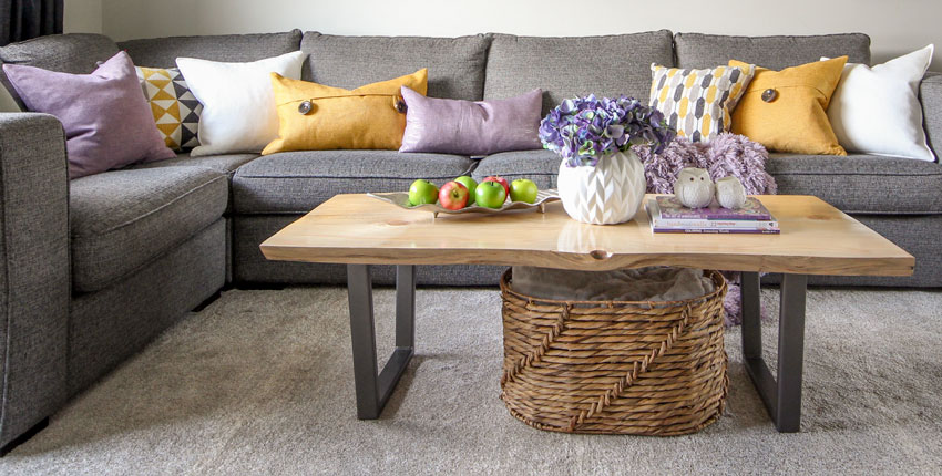
After – cozy, pretty photo

Lights on – REAL ESTATE PHOTOGRAPHER (Kitchen looks too big and NARROW here)

Before

My friend Jan Romanuk helped re-design the new layout of the kitchen, Kelly did not like the awkward corner sink and windows so they moved it.

After

Family room photo before (the old and dated millwork was removed)

After – photo by Barry Calhoun (Kelly colour blocked the books here and I love how she arranged the gallery wall in this room)

Lights on – REAL ESTATE PHOTOGRAPHER (Room looks out of proportion)

In the end when I compared the real estate photos to the regular pics, I understand why they have to be taken with a wide angled lens.

Many times it’s impossible to get the entire room in one photo unless you use that lens, however what the designers reading this should know is that magazines don’t feature photos using a wide angle lens. It’s important to avoid using a wide angle lens as much as possible and usually only in a tiny bathroom when it’s the only way you can shoot such a small space.


Photography by Barry Calhoun

And here’s a photo of my fabulous Design Assistant Kelly! They are in the middle of a huge renovation in the new house, so stay tuned, we’ll post photos as soon as we have them!

Over to you my lovelies, how do you feel about wide angled, real estate photos? Have you ever felt duped when you arrive to see a house you’d seen online only to realize that it was much smaller than it looked in the photos?

PS. The Withit Conference in Charlston, ‘Leading with Influence‘ SC is coming up June 25 – 27, 2018. If you are in the design industry, this is an amazing conference to attend to make new connections, learn from the great speakers and get inspired! Register here.

Related posts:

Danger: Free Advice will Sabotage Your Expensive Renovation

1o Steps for Planning Your New Build

Danger Zone; The First 24 Hours after you Take Possession

SaveSave

SaveSave

SaveSave

SaveSaveSaveSave

SaveSave

SaveSaveSaveSave

The post The Problem with Wide Angled Photos; Before & After appeared first on Maria Killam - The True Colour Expert.

How to Choose The Best Colours for a Staged Home; Before & After

$
0
0

Style at Home

I recently received such a good list of questions followed by photos that I decided to turn this readers entire email into a blog post that I think will help everyone, especially on the heels of my last post about clean vs. dirty colours.

First, here’s the fundamental lesson we learned from the last post I wrote:

Most of the time when we’re blaming the paint colour or the lighting as the reason the room doesn’t work (it’s too muted, it’s too earthy, it’s too clean, it’s too bright) the real reason, in other words, the first place you’d look if you were trying to determine what isn’t working about a room is this:

DOES THE COLOUR RELATE TO WHAT’S HAPPENING IN THE ROOM?

So if you have a room that is bothering you. That is the first place to look.

We all want to make it about the lighting, or about the paint colour, why? Because it’s easy to change the paint colour in a room, but as I’ve said many times, paint cannot do all the heavy lifting.

And sure, we can change the lighting for a slight improvement, but will it transform the room and suddenly give it the look and feel that’s missing? Will it magically make the paint colour now relate to the room if it doesn’t already? Not likely.

We have photoshopped the following rooms so you can see first hand that what I’m saying is actually true.

And the other thing that is kind of cool about all these fixes is that most of the time, the correct paint colour can be found in my curated collection of large paint samples.

So if you are a stager, colour will transform your spaces more than anything else, ESPECIALLY, when the homeowner is NOT prepared to do much else.

Then, if you’re stuck, all you have to do is start pulling out my curated collection of large paint samples that practically choose the colour for you.

I am not a stager, so I would appreciate comments from real estate agents or stagers here, but my take on what would be the best neutrals or colours to paint a house to sell would be CURRENT COLOURS.

So, if the majority of buyers right now want LIGHT and close to WHITE, then you should go as light as you can.

If a colour is necessary to bring a space to life an a neutral won’t do it, then choose a colour that is CURRENT.

Okay, here is Jennifer’s email:

First, please know that I have all your ebooks, read your blog and have even created my own paint deck with your recommended colors (divided into the sections, “Pink Beige,” “Yellow Beige,” etc.) I love to learn from you and would so love to take your Specify Colour with Confidence Seminar.  Not sure I’ll ever be able to afford it so I thought I’d write you some of my common dilemmas.  If they ever fit into a blog you might want to write I would love it!
All of my questions would be in regards to home staging (advising my clients who are selling their homes). 

And here is the first image she sent me along with this question:

Advising wall paint color – This wall color doesn’t relate to anything in the room.  But the yellow tub doesn’t go with the floor either.  What would I do here?  

Yes the biscuit coloured plumbing is not awesome with the white tile and shower insert along with the white cabinetry but if nothing else is changing except the paint, that will still make a big difference.

Since most people are looking for ‘light and fresh’ painting the walls a much paler taupe would immediately transform this bathroom.

AFTER BM Pale Oak (found in my curated collection of large paint samples)

So we took out the yellow cast that was happening with the lighting to fix the colour in this bathroom, so you’ll notice that the bathtub looks a lot less yellow now. And certainly the yellow in the tub was enhanced by the much darker purple taupe colour, and yellow and purple are complementary colours if you put them together, they will enhance each other and in this case, not in a good way.

Now the bathroom is much fresher and ready to sell.

I feel like this blue is too bright for selling . . . so do I find a beige that has the same undertone as countertop or floor?  would that be too blah?  If so, guidance on what color I should pick?  toned-down blue?  green?  how do I know?  

So first, let’s talk about the undertones here. The linoleum appears to be mostly green beige so the first colours I would pull out of my curated colours would be BM Feather Down and Manchester Tan. Or from the Sherwin Williams collection, Wool Skein.

That should be the new paint colour because after all we are selling and this random blue is definitely not doing anything for this kitchen.

The countertops and backsplash are a fake wood looking laminate and in this kitchen, it just kinda reads ORANGE. Unrelated to the floor and just bad. A laminate that continues onto a backsplash would work better in a more modern kitchen.

I’m guessing this kitchen is in a basement and there isn’t much natural light which explains the bad, and dated 70s sunshine ceiling.

If I was trying to sell this house, I would remove the ceiling light and install some track lighting instead. Then the lighting wouldn’t be sooooo YELLOW.

Okay, back to the colour. To prove that it’s really not a clean/dirty problem but more of a ‘The colours don’t relate‘ issue, I had the cabinets photoshopped to approximately the same blue.

It’s fine, but it’s kind of an uninspiring wedgwood blue that needs to be repeated in the kitchen in order for us to love it. However, the look is more balanced on the cabinets rather than the walls.

I found a blue with more purple in it (see the kitchen on the left, below) and it does look a little more inviting even without styling.

We also photoshopped the room without changing the cabinets, and you can see that there’s not enough contrast between the walls and the cabinets because they appear to be creamy. This is why I decided that painting the cabinets would look much better.

A kitchen this old should just be a fun colour to take the attention off all the dated finishes. This darker indigo blue is my personal choice (below). And might work for re-sale as this is a CURRENT colour.

Now you’re looking at the cabinets and not the mismatched floor and countertops.

Style it up with some blue and white ginger jars, and you’re done!

If you have an island this big, it needs decorative items on it AT ALL TIMES. This way when your kitchen is a mess, you still have something pretty to look at!

Related posts: How Styling Saved This Kitchen

Okay, moving on to the next kitchen:

Here they actually did a good job matching wall color to tile floor – but neither go with anything else in the room.  If I were to advise wall color (and maybe new floor), what wall color do I recommend?  Try to find a beige with similar undertone as cabinets?  Go to a color?  How do I know when to use one of these vs a beige?? 

I would not replace the floor here because it still needs to relate to the kitchen and it would be hard to find something that would improve this kitchen because what bothers me the most is the overuse of black.

I am not a fan of black appliances for this reason. Black gets heavy looking fast and they can look like dark holes, so a black countertop is usually required. Adding the backsplash and other black accents took this kitchen over the edge and made it dark and very ORANGE.

The best fix for this kitchen would be to paint all the cabinets which I would do BEFORE I would start searching for new flooring.

Therefore, a new, lighter and fresher paint colour does improve this kitchen without a major overhaul.

To answer Jennifer’s question, adding more orange to the walls would not be an improvement.

BM Abalone (Found in my curated large paint samples)

I remember you saying that wood floors are like blue jeans – they go with anything.  Is that true for floors this light?  Something feels off in this space – is it because the gray doesn’t relate to anything in the room or that the gray doesn’t look good with the wood?  Or something else? 

I’m so glad she asked this question because I now–for the first time in 20 years–understand why people are so confused about whether a grey paint colour, for example, can go with wood floors that are in the range of yellow and orange.

When anyone asks me, I’m always stumped and I reply with some version of: “Of course, but why do you think it CANNOT be done?”

Well, it’s because they are starting with a blank slate, looking at their yellow or orange floors and thinking that this eliminates any shade of grey period.

When I was a new decorator, I thought that I had to match the wall colour to the hardwood floors too!

Jennifer is right, the problem here is that the grey only relates to the flooring in the entry which you can see behind the red chair.

Related post: How Important is the Colour of Wood vs. Wall Colour?

So that’s the first question to ask. Do the grey walls relate to anything in this room? And the answer is no.

This room looks like the realtor or stager (not Jennifer) told the client to paint the walls grey because ‘That is what’s selling’.

However, this room does not have a look and a feel, and that’s what prospective homeowners want right?

The furniture looks like it came from their last residence and is not modern which is what belongs in this contemporary loft.

Here’s a great example of orange wood combined with dark grey and I love how the orange ceiling was not ignored at all, and was repeated in this modern interior (below).

In fact, you can see here that the orange tones bring the grey to life and keep the room from feeling too cold.

I think these herringbone floors are current but they are also close to a honey oak colour and it looks nice when you repeat the shade in the furnishings (below).

Image source

Here we have an orange toned dining table and chairs in a charcoal and black kitchen. In fact the orange does a nice job of warming up this kitchen (below).

Image source

Here’s a restaurant in Chicago (below) that is also a good example of warm wood tones used with charcoal.

Related post: The Minimalist Guide to Decorating with Charcoal

Photo by Maria Killam

In the end, if we’re selling this loft and I would paint it a really pale greige like Bm Soft Chamois which feels the most neutral in this case. It doesn’t relate to the furniture, but it’s the wrong style for the space anyway.

If you choose a blue grey, you now have blue walls and, well, there’s still no blue in the room. We are obviously not going to paint the walls red to relate to the chairs and a beige in the realm of light brown (which would give us pink beige) is obviously not popular at the moment either.

The greige still relates to the entry flooring and now just becomes a background colour. You could paint the walls a shade of white here to sell as well, white is modern and would also work, however the furniture would of course still look wrong (but it does regardless of what the wall colour is).

Here’s the last question, and I’m so glad she asked this one because I don’t know if I’ve addressed it with such a good example to show:

What wall color do you use with black and white bathrooms??  I thought this color looked terrible.  So, I recommended “Gray Cashmere”, but I don’t think it looked good either!  Is this the clean/dirty issue?  What color should I have recommended?

As I’ve said many times, (and go into in great detail in my White is Complicated ebook), cream goes with earthy and white goes with fresher cleaner colours.

The Taupe walls are very bad in this bathroom and the muted turquoise dies in here as well.

Some good options for a black and white bathroom and maybe the best for staging would be just painting the walls a true white. This gives the new homeowner a blank slate:

Image source

And here’s a similar bathroom with pink tile and of course it could be painted on the walls as well (keep scrolling):

Here’s a really clean turquoise but it certainly looks great with the black and white tile:

Image source

And here is the same bathroom photoshopped (below), and I thought the window mullions would look good in black because of the black tile baseboard and accent tile in the tile wainscotting.

Keep in mind there is a pink cast on the tile because the original photo was taken with the lights on.

As I wrote in this post, if you are a professional, your images will look way better if you take them with the lights off and no flash. The room will be dark but once you photoshop it or put it through an image lightening ap like Pic-tap-go, it’ll look so much better than the hot-spots that lights create in every image.

Okay, we are at the end of the list of Jennifer’s questions which turned into another epic post but I think we learned a lot in the process!

Stagers and real estate agents, lets hear from you!

Related posts:

Sell Your Classic House in 24 Hours Flat!

How to Create a Vignette or Tablescape

The Case for Decoration

SaveSave

SaveSave

SaveSave

The post How to Choose The Best Colours for a Staged Home; Before & After appeared first on Maria Killam - The True Colour Expert.

See the Hidden Beauty in this Modern Kitchen Renovation

$
0
0

My friend Nancy DeVries and her husband Brad have lived in their house for 9 years and two years ago they embarked on an extensive renovation. They added a garage, renovated the kitchen and laundry room as well as extended the kitchen further into their backyard where it backs onto a greenbelt.

Here’s her fabulous kitchen and laundry room:

AFTER (Kentwood brushed Acacia Wood Floor)

You can see that the previous kitchen was quite a bit smaller than the new one.

 Faux marble quartz countertops

Nancy and Brad have a cute Echidna toothpick holder they received as a gift from Brad’s parents when they came back from Australia. I kept calling it a porcupine, haha.

Cabinets and wall colour BM Ice Mist

Modern dining table (cleverly plucked from the office department) and chairs IKEA

Because their view from the large windows is so beautiful, Nancy wanted the view to be the focal point, NOT the hood fan, which is why it’s hidden.

Nancy chose not to install a backsplash, she loves the look flat and clean. The cutting boards propped up behind the stove catch any splashes from cooking.

Here’s a better view of the entire kitchen including the walnut cabinets that create warmth (above).

Faucet | the binoculars are handy for bird watching

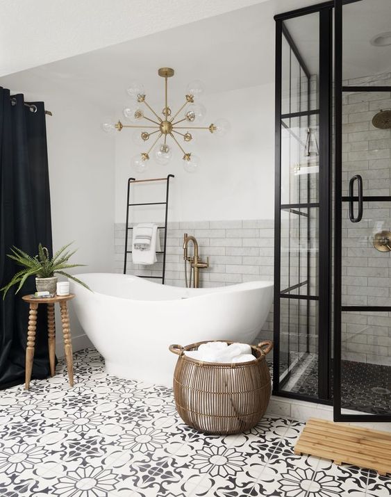
Walnut Cabinets | Chandelier: Bocci

Decorative Charger and vase from Martha Sturdy | Wire bowl from HomeSense

Wall Colour BM – AF 525 Fiji

Love the built in feeding dishes for Nancy’s dog Zoe!

Laundry room faucet | The hardwood floors are repeated in the laundry room.

Photography by Maria Killam

Nancy DeVries, Designer & True Colour Expert, Urban Aesthetics

Nancy lives in North Vancouver and specializes in colour consulting, decorating and window coverings. Currently, she is lending her expertise at Howards Paint and Wallpaper in West Vancouver on Tuesdays where you can book an in-home consultation with her or get quick help with your colour and design questions!

What is your favourite detail in Nancy’s kitchen or laundry room?

If you would like help with kitchen renovation or new build, you can purchase our Create a Classic Kitchen package here.

Related posts:

5 Ways to Warm up a White-on-White Modern Kitchen

Help! My New Kitchen Makes the Rest of my House Look Old

How to Avoid the 5 Most Common Kitchen Mistakes

The post See the Hidden Beauty in this Modern Kitchen Renovation appeared first on Maria Killam - The True Colour Expert.

Inside the Stylish Home of a Published True Colour Expert

$
0
0

Last week Claudia Ricciardone posted this happy news on our private True Colour Experts Facebook page:

I’ve got some exciting news to share and I can honestly say this would have never happened without Maria Killam‘s course. I just had my work published in Luxe Lifestyle Magazine! Here’s the link to read the article and my bio is in the contributor’s section.

The print edition will be out mid-October. It was Maria’s training that gave me the confidence to build my design business. It was also her class that introduced me to my design BFF’s, True Colour Experts Maxine Breedlove from San Angelo, Texas (who wrote the article),and  Cate Holcombe Raleigh from North Carolina. I am forever grateful to Maria’s class and to the friends I made during her workshop.  Thanks, Maria!!!!

To date, since I started leading this workshop in 2010, I have taught my System for Specifying Colour® to over 1000 design professionals, and colour enthusiasts. Whenever I encounter someone who has attended my course, they talk about how much more confidence they have now! It makes me so happy to hear all their stories!

Here’s Claudia’s and the tour of her beautiful home:


Main Interior Color: BM Revere Pewter

Melon Pendants |  Kitchen cabinet color: BM White Dove

Dining room wallpapered in Thibaut Fine Sisal in Seamist. Custom Wainscotting and chairs are in BM Decorator’s White.

Master bedroom wall color: BM Gray Huskie

Love her classic and timeless bathroom finishes. Then it’s so much easier to change the colours when the time comes!

Master bath: BM Gray Huskie | Photography by Brie Williams

I attended Maria’s “Specify Colour With Confidence” workshop in April of 2016. I am a residential designer who has always had an affinity for working with color. However, there were times when a color’s undertone didn’t quite work and I couldn’t figure out why? There had to be a method to more accurately choose colors. When I found Maria’s course, I knew it was what I needed to take my design business to the next level.

Maria is an engaging and knowledgeable teacher. I like that she is no-nonsense and direct but also warm and personable. Her course opened my eyes to the world of undertones and helped me to accurately determine appropriate color selections. The large color boards are key to selecting interior and exterior colors with confidence. I’m not exaggerating when I say that the boards work like magic. You can almost immediately see what will work and what won’t once you use the boards and understand Maria’s system.
One of the most valuable benefits of taking her course is the access you get to her private True Color Expert Facebook group. I’ve made so many great connections and the group has been exceedingly helpful when I’ve had design questions. 
Maria’s course has been one of the best investments I’ve made in my business. 
Which room is your favourite? If you have a question about Claudia’s rooms post it below!
Related posts:

The post Inside the Stylish Home of a Published True Colour Expert appeared first on Maria Killam - The True Colour Expert.

How I Ended up with a Magical Narnia Door in My Forever Home

$
0
0

Narnia

So, this is a post about a renovation wrapped in a personal story wrapped in a renovation. It’s a guest post from Irene Hill, my fabulous freelance writer:

“About a year-and-a-half ago my husband and I moved from the lush, green “rain forest” of Vancouver, BC to the arid-ish desert in the interior of the province. Yes, as far as classifications go, the Okanagan is, by virtue of the amount of precipitation we get, considered a desert. In Canada. I know. Many of you will be surprised.

Penticton

But before you imagine the Sahara Desert — where we live is only semi-arid and our town is nestled between two beautiful lakes, just five miles apart. At this time of year the town is bursting with lilacs and other spring flowers and deer regularly roam the streets and nibble at anyone’s greenery that isn’t fenced off.

For us, relocating meant selling our beautiful, newly renovated home where we took a 960 square foot house and added a second story plus a rear extension.

The Before

The After

The project took us five years as Kevin and I did most of the work ourselves, but in the end we had a beautiful home to live in as well as a rental suite that helped pay the mortgage. We thought this was going to be our long-term, next-stage home and were anticipating happily living there for the foreseeable future.

We got Maria’s first rule of design — boring now = timeless later — part right and then she came with her magic styling wand and added the finishing touches (below). It was perfect.

The After (decorated at Christmas time which explains the berry wreaths in the windows)

The reason for this radical 235 mile (380 km) relocation came through a phone call with a dear friend who was losing her battle with cancer. The most heartbreaking part of this story was that she would be leaving two amazing children behind and, of course, their well-being was top priority.

Elsa (14) and Ethan (12) had always lived in the same town, in the same house and had a strong community of friends to love and support them. But now they would need someone other than their darling mom who would make them that top priority.

Kevin and I looked at each other and said, “Widows and orphans.” That was all it took. God asks us to look after these special groups of people and we both knew this was our time to do so.

But before you’re tempted to think too highly of us, let me rush in to let you know that these two are incredible. And wonderful. There was a line of people who wanted them. We were family friends so that helped, but from Day One they opened their hearts wide to love us and let us love them.

Their mom did pass away shortly after that initial phone call and we moved into their lives and into their home. And, in spite of their deep sorrow, it has been — I can’t even think of the right word. Miraculous comes to mind.

In the intersection of the body blow of their grief and my personal heartache over never having had children, our new blended family found blessing and love in an unexpected way. A way that has bound the four of us together in increasing happiness and joy.

Of course, there have been challenges. But seriously, nothing more than the inconvenience of sharing one bathroom with two adults and two teenagers. Their beloved family home was tiny. It started its life back in the 1930s as a fruit picker’s shack, and each little addition was pretty much just slapped together. But for them, the house was filled with a lifetime of love and life memories, so it was important we stay for a season.

But now that season has come to an end and we have a new family home to look forward to. We bought a luxurious half acre and everyone is excited to move into a bigger home with the promise of fruit trees, vegetable garden, a pool and room for all our many, many friends to visit.

This home was built in 1954 and, like the tiny house, was added on to and “renovated” in weird and wild ways.

The Front Before

The Back Before

As this is now our “forever” home we wanted to renovate and make it our own.

Our new-to-us four-bedroom home had a small kitchen that measured 8’ wide by 11’ in length. Oddly small for a home with the potential of six+ people living in it:

A series of small living spaces were broken up by an internal staircase located smack dab in the middle of the entry hall, original living room, added space converted from the original front porch and an eating area. An ideal racetrack for children to run around, but not quite our dream:

Hallway showing internal staircase to the right

Living room showing internal staircase to the left with closed-in porch at top of photo

Eating area with built-in ironing board behind cupboard door

Another angle of the eating area

And while it looked like the roof was in good shape, new shingles had just been nailed over the original slat boards from the ‘50s. Sigh. So the roof had to come off. We were replacing windows and closing in the alcove at the back of the house, and, according to our contractor, it would be easier to remove some exterior walls and rebuild them to relieve the wonky original framing:

Where the front of the house used to be

Where the back of the house used to be

Does it look like we’re going backwards?! As far as rebuilding the house goes, maybe a little bit time-wise. But this is where Maria’s second rule of design comes into play — waiting now = beautiful later.

An unexpected blessing in going backwards is we gave ourselves a ceiling raise! From 8’ to 9’. And we vaulted our ceiling in our new great room. Once the roof was taken off, it cost only pennies (relatively speaking) to make these two massive upgrades. Bliss. As our property is in the country-ish, we decided to go with a modern farmhouse style. I know, I know, it’s wildly popular and trendy right now but, we’re going to go with it for two reasons:

1. I have loved this style for many years prior to this trend and will love it long after the trend is over.

2. I’m fully committed to classic and timeless no matter what style we go with.

This means we’ve chosen white window frames (not black) and are staying away from the wildly popular shiplap walls. Here are the hard finishes we’ve chosen so far:

Inspiration: Vaulted ceiling

Inspiration: Wide-plank white oak floors

Inspiration: White painted brick fireplace surround

Inspiration: Shaker cabinets with apron-front sink

And for the exterior, our 66’ long rancher will get a whole new treatment of black roof, butter cream shake siding, white window frames and black front door:

Inspiration: Front door

I’m so excited as we move forward with our dreams and plans. We have many magical and wonderful ideas that include a wall of 9’ high bookcases with a library ladder (I’ve wanted this since I was a little girl),

Bookshelf ladder

A Narnia door (where you walk through the back of an armoire to get to another room):

Narnia

A bumped-out window seat in our girl’s room, a secret pass-through between the kids’ rooms (don’t tell anyone) and a pergola that measures 50’x12’ where we can fit long tables end-to-end for 35 people to sit down for dinner.

Pergola

When it’s your forever home you can make a list of all the wonderful dreams you’ve ever had and slowly but surely, make these dreams come true.

And for me, when I look at the clouds, the land and the potential of fruit trees and blossoming flowers, when I hear the birds sing and the wind whisper, when I feel the warmth of sunshine and light and the gift of a family, I feel the truth of waiting now = beautiful later in so many more ways than just around design.”

Ethan, Kevin, Irene & Elsa

Thanks Irene, love this update on your house, look forward to more!

Related posts:

Two Magic Words to Move Your Design Project Forward

Learn to be Bossy, Yet Charming

White Farmhouse Exterior Transformation; Before & After

The post How I Ended up with a Magical Narnia Door in My Forever Home appeared first on Maria Killam - The True Colour Expert.

Parisian vs. Tuscan Staircase; Yay or Nay

$
0
0

In the 20 years I’ve been in this business as well as the more than 10 years I’ve spent blogging, I have seen a lot of staircases. In person, and in photos. Some good, many that are just plain bad.

This trip to Paris is Terreeia’s first trip (my third). This time I was struck by the style of all the Parisian balconies and noticed that many (or even most) of them are really busy. But they still look gorgeous because of the architecture and tone-on-tone colours of the buildings.

And it got me to thinking. Maybe there’s nothing wrong with a really busy wrought iron staircase? Maybe it’s everything attached to the staircase that makes it look dated and wrong.

Read on and tell me if you agree with me:

Brian Thomas Jones

One of the things that makes Paris so beautiful is the uniformity of the buildings. They are mostly all the same colour (a yellow beige, sometimes green beige) and the sweeping style and delicate filigree that characterizes Paris architecture today is largely a result of George Haussmann’s work. An architect commissioned by Napoleon III to open, unify, and embellish Paris.

On our tour of Paris,  the first day after we arrived, our guide took us to this street (above) to show us what the old Paris used to look like. The streets were dark, dismal and so narrow there was barely enough room for one cart to traverse.

Here’s another photo of an old Paris building:

It was puffer weather when we first arrived in Paris (below):

And of course here are what the buildings look like now:

And what makes Parisian staircases so pretty, is they often have black and white (or grey) tile or black checkerboard tile to repeat the wrought iron railings.

Parisian Moments

The cafes throughout Paris are so charming. Happily, everyone got the memo about installing bistro chairs and adorable round tables that often face the street so the patrons can people watch as they sip coffee and eat croissants.

Many of them have planters with boxwood or beautiful, coordinated, plant material like this (below):

Photo by Maria Killam

In the little town where we live back home, we have a little bakery/cafe where the owner hired a designer for the interior and he did a great job.

But then, the following summer, he decided to add an outdoor patio (and obviously thought he could do it without his designer). So he built a huge, out of scale pergola, and then picked up a bunch of bad residential patio furniture with multi-coloured umbrellas from the nearest big-box store.

I was so underwhelmed, I have not been back since.

It’s the details that often make or break any design project. One decision on something seemingly small and inconsequential can ruin a staircase, kitchen or bathroom, (the list goes on and on) that otherwise could have been perfect.

Ask Maria: My Husband Got One Choice and It’s Wrong, HELP! 

The view of the rooftops outside our hotel room in Paris (above)

Here the railings get more simple at the very top (above)

Chateau de Bouceel

In the middle of our trip to Paris, we drove out to Normandy and stayed in this Chateau, built in 1763.  The floor tiles are black and orange beige. The steps are concrete.

Notice the curvy style of the wrought iron railings (below):

And how it relates to this railing (below).

I took this photo in a new build I was visiting over 10 years ago. The designer who worked on this project confided that the original design (by the client) was MUCH busier than it is, even now, before she intervened.

I posted it here because it was so similar to the staircase above.

Well, what do you think? Which one is better? Why?

Here’s another staircase from a Chateau in France. Notice the same black tile repeated in the entry flooring.

Architectural Digest

Classic and timeless.

So timeless, that it has been the same in the Chateau we stayed in, for over 250 years.

Here’s the 24″ x 24″ parquet flooring everywhere else:

And the bathroom attached to our room? Plain white tile that would not need replacing anytime soon.

At breakfast, when I asked the owner how many bedrooms were in the chateau, he replied that he didn’t know. But he did know that it had 99 windows and he had replaced 45 of them, haha.

The mirror reflects the windows and beautiful grounds behind the Chateau

Here’s a typical Tuscan inspired staircase. The black wrought iron gets lost among the wood stained bannisters, cherry flooring and pedestrian pink beige carpeting.

Suddenly it looks trendy instead of timeless.

Decoratoo

And we start looking around for white paint and a simple design to update when we can (below).

Poirier

Over to you my lovelies! What do you think? Do we need to break open some white paint cans and install some black and white checkerboard flooring or what?

Parisian or Tuscan? I vote Parisian.

If you would like your new build to fill you with happiness when you walk in the door, check out our new build eDesign package here.

Related posts:

Is Your Bath Perfect or Perfectly Nice?

How to De-Tuscanize Your Home; Before & After

How to Update Your House from the Tuscan Brown Trend

The post Parisian vs. Tuscan Staircase; Yay or Nay appeared first on Maria Killam - The True Colour Expert.


5 Classic Ways to Customize Your RV Travel Trailer: Before & After

$
0
0

When you understand the basic principles and colours of classic and timeless design for a new build, it’s just as easy to make your own choices  when it’s time to customize your RV.

Lea and Greg’s Boxer Lab Cross (Babs)

My sisters partner Greg (below) retired this Spring and to celebrate, they bought a new RV Camper to replace their old one! Lea called me to help her choose their own finishes because the standard choices were still in the Tuscan brown trend.

Greg & Lea

Oak or Maple Millwork

There were two choices for the cabinets. Oak and maple. We chose maple because the oak option still felt too much like the 80s.

Before

The walls in this camper are padded white vinyl.

After


There are two colour choices for classic and timeless wood floors

Pale or medium brown floors.

You could choose grey but it would place your colours in the grey trend.

We chose the medium brown option (above)

The bathroom has a shower in it as well! Lea spotted this little hit of plastic greenery that fit perfectly in the shower caddy!  You need something to look at when the bathroom is this simple!

Greg always brings the guitar with them when they go on the road (below):

Choose vinyl for the seats and a treated outdoor fabric for the backs

These are the standard finishes if you don’t upgrade and choose your own. However, each upgrade costs only $100 extra, although you do have to pay for your own fabric for the bench seats and the slim valance that covers the pink beige honeycomb shades (there was no option to change that colour).

It’s the reason why I think pink beige should be banished from the colour world. It’s too often chosen as a default colour.

Lea fell in love with this treated outdoor Paisley fabric online and after she ordered it, we found a vinyl Sunbrella for the seats to coordinate. We repeated the solid blue on the valances (because did not have the option to choose a third fabric).

We were thrilled to find the two patterned pillows, one with pussy willows and the other with these fabulous turquoise and purple leaves (hey we are camping in nature) that coordinated perfectly with her fabric.

White faux marble laminate countertops go with everything

The new white faux marble countertop is perfect (below). Classic and timeless!

Lea spotted these Moomin camping mugs (made in Finland) on an Instagram site she follows.

I always love a cute face!

I love this sweet little little black plant pot with faux lilies of the valley

Coordinate your exterior colours with the interior

There were countless colour options to choose for the stripes on the exterior of the camper. Once we had the interior colours chosen it was easy to make this final colour choice.


And here’s my sweet sister Lea, happy in her newly decorated Escape RV!

Well what do you think? Happy or what? I love it!

If you need help with your RV colours, our Get me Started package can help!

Related posts:

A Window of Happiness

Second Rule of Design; Waiting Now Equals Beautiful Later

My Sister’s New Kitchen; Surpise! It’s NOT white or Subway Tile 

The post 5 Classic Ways to Customize Your RV Travel Trailer: Before & After appeared first on Maria Killam - The True Colour Expert.

How to Transform a Charcoal Sofa with Colour: Before & After

$
0
0

Shari and her husband couldn’t agree on a ‘colour’ when they went shopping for a new sofa, so they chose charcoal.

The reason why they couldn’t agree on a colour, is because choosing a sofa BEFORE the carpet, artwork or throw pillows is like picking all the paint colours for your house BEFORE you buy a stick of furniture.

If you don’t have an inspiration starting point, then it’s much harder to make decisions on paint or furniture.

And the reason why most people ignore this advice and just pick colours or a sofa ANYWAY is mostly because if decorating is not your gift, choosing an area rug or a throw pillow, might be even harder than just buying a new sofa.

Tell me if I’m right? This is just MY theory.

Shari had been following my blog for a while and she sent me a note asking if I could help.  Since she lives almost across the street from me, I popped over to take a look.

Her husband made their coffee table out of a slab of wood. It adds a nice touch of warmth to the space.

Also the other thing they did right was they didn’t just buy a set of matching coffee tables. A collected look is always better than three matching coffee tables (same goes for your bedroom).

The medium brown floors are also just right. Timeless and classic.

Shari has a daycare business in her home in Yarrow. She has two of her own children, 7 and 11, and during the week she’ll have up to 7 children in her home ranging from 11 months to 9 years old.

She needed a carpet that could get dirty and not immediately show everything. I suggested yellow or white curtains to replace the grey ones, but Shari said the charcoal colour worked better for room darkening if the TV was on during the day.

I said if all she needed was a carpet, pillows and some accessories, we could do that kind of transformation in just one day, with a single trip to HomeSense.

I snapped a picture of the existing artwork, grabbed a sofa cushion and three and a half hours later, this was the result:

We choose the art with the red umbrella to coordinate with the existing art work, this made the wall look more finished. The area rug, eight new pillows, a basket for throws, some vases, purple books for the coffee table, and some smaller, more interesting shaped frames, all this for a little under $1000.

When you buy an area rug to coordinate with YOUR charcoal sofa, DO NOT buy the matching charcoal shag from Costco. You need to ALTERNATE the contrast. A dark grey rug would have died in here with the sofa.

The drapes should also be a colour or white (off-white or cream) but as already mentioned, Shari says the charcoal drapes block out the sun more effectively.

Anytime you see a tear-shaped vase, pick it up. You need so few flowers to add a splash of colour to any vignette. Make sure all your frames are NOT the same size, you need a variety of sizes to turn them into an accessory.

These frames hold photos of her 9 year old son Tyson, the football star!

Also, notice that I added some coffee table books underneath the lamp to give it a little more height. A trick anyone can use.

Shari’s end table was already just right for the space. But the first thing I did with the sectional was move it 4″ away from the wall. Give your furniture some space to breathe! It also allowed the curtains to hang freely.

Before

We repeated the marigold colour on the other side of the room in the vase.

The organic coffee table adds texture and warmth.

I photoshopped the charcoal drapes so you could see how the room looks with white.

And here they are in the marigold shade

Here’s the before again:

And here’s the after again:

Which drapes do you prefer? The charcoal, white or gold?  Let me know in the comments!

I like the purple in this colour scheme because it feels trendy and current. Pinks and purples are coming on trend big time, because they feel newer than some of the blues and greens and oranges we’ve been decorating with for a long time.

Maria & Shari

When I arrived on Sunday to take photos Shari said, “I wish I had video taped my daughters reaction for you when she walked in the door, she shrieked with joy and started rolling around on the rug”.

That’s what happens when you suddenly have a look and a feel.

Later, Shari sent me this note:

Being a huge fan of your blog and your work, I was still so amazed at how quickly you chose different colours for everything we bought that day and how they all just worked. I am so very grateful. You made my cold living room into a cozy and beautiful room for my family. Thank you!

If you live in the lower mainland, and would like a one day transformation, contact me here.

If you need an eDesign transformation, you can purchase our ‘Get me Started’ package here.

My very first business before I fell in love with colour was called One Day Design. Transforming an interior in just one day with a little styling is still my absolute favourite thing to do!

Don’t forget to let me know which colour drapes are your favourite!

I leave for my Austin Specify Colour with Confidence event in exactly one week, I’m excited! It’s much warmer there than it is here right now!

Related posts:

How NOT to Choose Paint Colours; But Everybody Does It

How to Coordinate Coffee & Accent Tables like a Designer

Four Ways to Decorate around Your Charcoal Sofa

The post How to Transform a Charcoal Sofa with Colour: Before & After appeared first on Maria Killam - The True Colour Expert.

How to Avoid the 5 Most Common Kitchen Mistakes

$
0
0

Tricia Firmaniuk, my fabulous Virtual Design Assistant, wrote this great post about kitchens. Let me know what you think!

______________________________________________________________

Here’s a kitchen I found listed on Zillow that has clearly been recently renovated.

And while the outcome is not terrible, I don’t think you will find this kitchen popping up all over Pinterest.

So I thought we could pick it apart, not to be critical or mean, but because this is such a common scenario, and then we can gain some useful insight into why so many renovations fall a little short of expectations.

Contemporary Kitchen with Emser Tile Lucente Random Sized Glass and Stone Glossy Mosaic in Grazia Linear, Pendant Light:

From Zillow

First, let’s talk about the use of pink beige walls. Wha?? It would make sense if you were working with a bossy pink beige travertine tile for example, but why introduce pink beige here at all? Maybe the adjoining room dictates pink beige, in which case the kitchen should never have been gray.

What I see at play here are several of the mistakes that we see frequently leading homeowners astray when they tackle DIY renovations:

  1. Worrying about a white kitchen being cold

This is a big one. We hear this concern often from our eDesign clients, so let’s get into it.

It’s likely that the wall colour choice is an attempt to “warm up” a white and gray kitchen. This is one of the perils of thinking of colours in terms of absolute “warm” and “cool”, rather than in terms of distinct undertones.

If you look at this kitchen through the lens of Understanding Undertones, you can easily see that the pink beige walls don’t relate at all.

First, if you’re installing a wood floor (NOT a blotchy wood look tile like they have here), your kitchen will have plenty of WARMTH with a wood floor.  White and wood is a magically balanced combination, white is crisp, bright and airy and wood is warm, patterned and grounded and best of all mostly NEUTRAL.

The floor tile here unfortunately is a good example of what not to choose when shopping for a wood look tile.

Something much less busy and more solid would have been much prettier and more convincing. It’s a common pitfall to fall in love with the more “interesting” looking small samples with seductive variations in tone and colour, but once you install it wall to wall, those patterns become repetitive and busy, not pretty at all. A quieter tile here would have given this kitchen the “warmth” of a wood floor.

The reason Maria so wholeheartedly promotes white kitchens is that they are timeless (even if they also happen to be trendy at the moment). The idea is to create a neutral and classic, white and wood backdrop so that you can get creative with decorating and styling, changing it up as frequently as you like for years to come.

Here’s a white kitchen that is beautifully styled (below) with natural finish cane backed bar stools and pretty gold pendants.

Related post: Ask Maria: Will my White Kitchen be Cold?

Victoria Hagan via Elle Decor

2. Trying to match hard finishes and paint colours to your wood floor.

This is a classic rookie mistake. It’s possible that they felt they needed to coordinate the paint colour with the “wood” floor here. However, your wood tone is RARELY a major consideration when choosing a COLOUR for your interior.

This is so common. When faced with choosing colour and with not much else yet in place to consider, people often default to fretting over their wood colour to inform their choices. When really, you need to make some decisions about decorating and the look and feel of the space to inform your colour choices, not look to the wood.

It’s like asking the grass what colour your flowers should be.

Let’s take a moment to get our dopamine levels up by looking at some gorgeous kitchens where the wood floor appears to be ignored in the other fixed elements to glorious effect.

©MandyOliver2015 for Nicole Davis

From Nicole Davis Interiors

In this kitchen above, the designer has used pretty wood stools and cutting boards to bring a bit of “warmth” into this white kitchen. NOT beige quartz, tile or paint.

From Coastal Style Blogspot

Here’s a creative way to add warm wood to a modern white kitchen, a large vintage surfboard!

Imagine sitting down with the little sample of solid white quartz and a sample flat panel glossy white cabinet. You might be worried about it being “cold” or boring right? This is why you need to have the end result in mind. It’s easy to imagine panicking and picking out some “more interesting” busy, bossy countertop material at the last minute, losing the powerful simplicity and restraint of this design.

3. Installing a trendy backsplash

How do we all feel about the backsplash in our specimen kitchen?

Since pencil mosaic is no longer the backsplash heart throb of the moment, it reads as not being very current. It’s pattern competes with the  busy, stripey floor in an unpleasant way, and if we want to get super picky, it is a bit too blue for the green gray quartz on the perimeter cabinets.

Now we have pink beige walls, green gray quartz and blue gray backsplash tile. Hmmm, that’s three undertones plus white and wood. The wall colour really needs to pick a lane here. I think I would go with a pale blue gray like BM Horizon OC 53 because look at how the choppy this feels with the pink beige meeting with the blue gray of the tile and the white of the cabinets.

Here is how the kitchen would look with blue gray walls BM Horizon OC 53

And this is the problem with installing a backsplash in any other colour than white, you have now chosen a PERMANENT wall colour FOREVER.

Matching the backsplash to the countertop is another common mistake. Your backsplash will look much better blending with the cabinets and walls on the vertical plane where it interacts more than with the little strip of countertop.

Which brings me to another often missed consideration in kitchen design in general.

4. Not Managing Contrast and Transitions

See how there is an awkward little pink beige upside down U shape framing each window? Wouldn’t it be better to run the backsplash all the way up to avoid drawing attention to these silly floating shapes by painting them a contrasting colour? Or, the walls could coordinate with the cabinets or the backsplash to eliminate some transitions here.

Even better, install a white backsplash and it will blend seamlessly with the cabinets and window frames and eliminate a whole whack of awkward transitions here.

Here it is with a white backsplash, prettier right?

A white backsplash is not ALWAYS  the answer.

In some contemporary, high end kitchens, the designer might intend for the backsplash to read visually as a continuation of the floor or countertops for a custom look. Like in this glamorous, masculine kitchen below.

46 Marvelous Designs of Masculine Kitchen

But in the average transitional home, a white backsplash is the most classic and goof proof choice because it blends with the cabinets which are the other vertical element in the design, so you don’t have to manage the shapes it will carve out of your space and be a brilliant layout whiz to make it work, see?

A dark or mid-tone backsplash in a white kitchen will always create some Tetris like shape action, and you’d better know if it’s a shape you want if you consider going that route.

Image result for tetris

How fun is this analogue wooden block Tetris set! via The University of Oxford

Anywhere you create contrast you draw the eye. If you create soft transitions by keeping elements the same colour, you eliminate a lot of unnecessary visual noise. A well composed space uses contrast deliberately to direct attention to focal points and create balance.

Glossy tiles -- basic subway tile in a herringbone pattern -- cover the entire wall behind the vent hood for a high-impact, low-maintenance backsplash.:

From Better Homes and Gardens

So, I don’t know about you, but since this is a real estate listing, yes, I might buy this house if if met my needs despite the cosmetic issues in the kitchen and immediately change the backsplash, paint, and floor, (or maybe not, it could get expensive), but for the same amount of money or less even, this kitchen could have been so much more classic and appealing.

Which brings me to the final critical mistake homeowners make when they renovate their kitchens.

5. Not getting professional help

Kitchen renovations are not cheap and mistakes are expensive. If you don’t design kitchens all day long, it’s much too easy to fall into the mistakes of inexperience. And you probably don’t know where to start and what comes first and then next and why. And that’s totally fine, because hopefully you only have to do it once!

So hire someone to figure out the best layout and functionality for your kitchen rather than wasting space, and take advantage of our convenient eDesign consultations to make sure the undertones of your finishes and colours are perfectly coordinated for the most classic look possible for your kitchen here.

If you need help determining which package is right for your needs, email us here.

Thanks Tricia for this fabulous and helpful post!

Okay which tip are you taking with you today?

Related posts:

The Right way (And the Wrong Way) to Install Porcelain Wood Floors

5 Steps to a Kitchen You Will Love

Selecting your Kitchen or Bath Backsplash: Accent Tile or Not?

The post How to Avoid the 5 Most Common Kitchen Mistakes appeared first on Maria Killam - The True Colour Expert.

Ask Maria: What’s Next After the Grey Trend?

$
0
0

Lately I have been getting many emails from readers asking questions like this:

Maria, what comes next??? If we are nearing the end of the gray and white “fresh” trend. What’s next!!??? I’m starting the process of updating a 1990 normal sized (1800sf) house – nothing touched since built in 1994. 

I don’t want to spend all this money and end up with a dated house in a year.

Thanks!!!

Again, if you have recently re-modeled or built a house and you aren’t in love with the result? Well, you should just skip this post because if you read it, you’ll understand why and sometimes I just think, ignorance is bliss.

I have been in the colour industry for 20 years. This means I started specifying colour at the end of the 90s when sage green was the ‘trendy neutral’ of choice.

Then in 2002,  chocolate brown and blue came along. The brown trend was over at the beginning of the 2000s but builders are still–as we speak–installing espresso kitchens because most builders are men and men perceive wood to be more valuable than a white kitchen.

I started talking about grey in 2009 when I started writing this blog. Grey is still going strong but it’s been 7-8 years now.

A trend has a shelf life of about 10 years which is quite different from a fad which is very short lived.

An example of a fad is backsplash tile.

Since I have started writing this blog, backsplash/accent tile fads have come and gone about 4 or 5 times. The current Encaustic tile trend will be just as short-lived as every other trendy tile that has arrived on the scene.

Last Fall when I attended Maison and Objet in Paris, black was everywhere.

I’m seeing more and more black bathrooms, black tile and black exteriors.

So let’s go back to the late 90s for a second.

Sage green was the sofa, tile and exterior default neutral.

Kitchen | Sofa| Sage green exterior

If you still have a sofa from the 90s, it’s most likely sage green. Many of you have bathrooms filled from top to bottom with sage green slate. If you have not painted your house since the 90s, it’s probably a shade of sage green.

And of course, fast forward to 2002 when the Tuscan brown trend arrived on the scene. I was looking for brown and blue fabric about two years before the fabric companies caught up to this trend.

Bathroom  | Brown exterior

Then in 2009, I started talking about the Grey (fresh, clean colours) trend, just a year into blogging.

When clients ask me to specify charcoal for their exterior or for a sofa, sometimes I’ve been known to say “But why aren’t you asking me for brown?”

“Because I don’t like brown”, they would reply.

That’s right, because that trend is OVER. Just a few short years ago, you would have wanted brown.

This is exactly why you shouldn’t paint your house charcoal or install a charcoal kitchen unless you have lots of money and can change it out as soon as you’re bored, which will happen as soon as the trend is REALLY over.

It’s on the fringe of being over already.

Bathroom | Charcoal exterior

Here’s the thing.

There’s nothing wrong with a little bit of sage green, I just got a new book from one of my designer fabric sources and it’s full of mossy green fabrics.

When was this decorated? Hard to know. It’s not brown from top to bottom (and it’s still pretty brown). Miles Redd

There’s nothing wrong with brown either (above). When the brown trend arrived, people said “I love it! Just like every room needs a hit of black, this is the same but warmer”.

In April, I mentioned that my fabric rep had arrived with some brown fabric books. Does this mean that brown is back? No, it’s a book full of brown and grey patterns so that if someone has a brown sofa, they can introduce grey with a fabric and tie it all together.

However, is the planet going to go back to installing brown kitchens and brown tile and painting their exterior brown anytime soon?

NO.

You’re still going to have brown tones in your case goods. If you go with the washed and distressed grey look it will also look dated very quickly. In addition to all the sleek and solid espresso brown furniture and brown leather parsons chairs that are now dated. A little of any of these trendy items works because your house won’t scream ‘Decorated in the ______trend’.

The reason the grey trend arrived is because colour was moving back to the 50s and 60s. Brighter and cleaner. Grey is the crisp backdrop to brighter colour as I’ve said time and time again.

source

Nothing wrong with a little bit of grey. Paint your white or cream (or black and white) bathroom (below) or dining room charcoal (above) to get your grey fix, just don’t choose grey blindly, over and over again with each colour decision you have to make.


source

Okay, are you depressed yet?

I’m not trying to upset those of you who feel you have too much of any of these neutrals, but the thing you should notice is that IF you are upset, it’s because what I’m saying rings close to the truth.

What do you do if you have missed all these trends and are renovating or building your new home now?

Does it help you to know that black is the new grey?

NO. Because the answer to colour decisions while renovating or building your new house is still not going to be BLACK.

Maria’s white kitchen | Maria’s living room | Exterior

All the classic and timeless colours I constantly talk about on this blog still apply just like they did 9 years ago when I started writing this blog:

1. Medium brown or pale wood hardwood floors.

2. White (or cream) kitchens (because you can change out your colours every 6 months if you want)

3. Cream (or white) bathrooms. (go back to number 2) and because the next homeowner then won’t have to rip our your very personal and trendy choices, immediately.

4. A sofa in your favourite colour. (my yellow sofa (above) is 7 years old and still awesome)

5. Silver (combined with easy to switch out items in gold like lighting and hardware)

6. One pattern in hard finishes like tile and countertops is the quota for each room.

7. Keep the patterns in your permanent finishes quiet.

8. Simple mantels in a modern or traditional style but without the usual trendy stacked stone (because the colour will surely dictate your palette forever.

I could go on and on of course but I think I’ve hit the most important areas for this post today! And hey, it’s just my opinion, doesn’t mean it’s right. Take whatever advice works for you and throw the rest out the window! A little styling goes a long way if you ended up with a space you don’t love.

I would have loved it if someone had told me that buying a leather forest green sofa and loveseat back when I was a newlywed in the 80s was totally trendy. Back then, I was convinced it was a totally classic and timeless decision.

My last advice is before you start making decisions on the most expensive purchases most people will make in their lives, hire a professional. Check out our eDesign services here or find someone local to hold your hand. Interview your designer to make sure you get someone who has a classic and timeless aesthetic, I don’t want this to happen to you.

If you are a design professional and are interested in learning about trends, colour and discovering how to design your clients homes from a classic and timeless aesthetic, spend three days with me this year in a workshop near you.

Related posts:

How to be Smart in a World of Dumb Designers

Bad Design Advice: Fall in Love With All Your Finishes

Is Black the new Grey? Trends from Maison & Objet

One more Reason you Should Skip Accent Tiles Altogether

The post Ask Maria: What’s Next After the Grey Trend? appeared first on Maria Killam - The True Colour Expert.

The Great Kitchen Contract Hoax (Do NOT make This Mistake)

$
0
0

My neighbour Shari and her husband Josh renovated their kitchen this past Spring.  They chose someone who came highly referred by their friends. He had installed two kitchens for them and they were beautiful.

This is the note I received from Shari:

“We went to Home Depot and a few other kitchen stores but decided to go with him since we saw his work in our friends home.

We paid the first half of what was owing for the completed kitchen. His contract stated that we were to pay half upfront, and the final half was due upon delivery and in our minds completion of the kitchen.

On the day of the installation, he arrived with a young employee and installed most of the kitchen in under four hours. All that was missing was the doors.

After he left Josh and I took a look at his work and were dismayed to find all the chips and damage. The fridge panel was crooked. (below) He cut part of the crown moulding too short and just patched in a one-inch piece to hide it. etc.

We emailed him right away listing the imperfections and he said ‘Don’t worry we are not done’. He was coming back to fix it and put the doors on. He told us to keep our check-measure appointment with the countertop company to keep it all moving and on schedule.

The counter guy arrived and said he couldn’t measure them since the fridge panel was installed incorrectly. 

A few days later two young employees showed up and put up the doors and handles. Every handle was crooked. They filled the chips and holes and left. Josh emailed the kitchen guy right away with pictures and a detailed list of all deficiencies.

A week later the kitchen contractor messaged Josh to confirm he was coming back that day and requested that the final payment was waiting for him.

Josh declined and responded, ‘When we are sure the problems are corrected we will cut you a cheque the same day’. The kitchen guy refused and said he would not come back to do any more work. He noted that the contract stated that final payment was due upon delivery.  He told us he could have delivered the kitchen in boxes and the payment would have been due.

We consulted with a lawyer and she confirmed that according to the way the contract was written, we had no choice but to pay him what we owed.  After that, he came back and fixed the crooked handles and patched a few holes but obviously, the gables remained, given the kitchen would have had to be entirely disassembled to move them.

We have a friend who is a contractor who gave us some advice and helped with a few little things. The rest we have just had to live with. It would have cost an additional $3000 in repairs.

The lawyer said that the contract should have said “Final payment due upon completion of the installation”.

I’m telling you this story so you can also make this adjustment to a contract when you plan your kitchen or bathroom renovation.

I asked Shari if I could style her kitchen and post this story on the blog to save anyone else from going through this.

I’ll also share the other thing I learned from renovating my three bathrooms this summer, at the end of this post.

First, here’s Shari’s new kitchen. She had been following my blog and decided that her small kitchen would be best in white-on-white.

They had lived in the house for 12 years and eight years ago they stained their oak cabinets brown (below).

Shari and Josh already had medium brown hardwood floors in their house (see their living room in this post) and I told them to continue the same floors into their kitchen and dining room.

They did not have more of the same floors they had installed in their living room and hallway so they took a sample and went to every single flooring store in the lower mainland but could not find anything close.

So they ordered tons of samples from online stores and finally found this one in California. They paid more for shipping, but in the end it was an almost perfect match!

I was so impressed, I did not notice they were different at all!

Shari liked the white beveled subway tile so that’s what they installed along with off-white quartz countertops.

Just in case you think all my styling ideas come from the clear blue sky, they don’t. When I was thinking about what I would bring (or buy) to style Shari’s kitchen, I was reviewing my ‘Kitchens and bathroom styling’ Pinterest board and came across this image:

via Pinterest

I didn’t have a tall 3-tiered stand, but I do have a small white one, so I puttered around, picked some white Fall Daisies from my garden and some small faux pears from another display in my kitchen along with some tiny bowls and Ramekins that Terreeia uses when she’s prepping meals or serving condiments during dinner parties.

I have all kinds of random vases and I happened to find some tiny ones someone gave me once for placeholders at a dinner party.

When you have a white (or off white or cream) kitchen or bathroom, you can introduce almost any colour you want!

It’s a beautiful thing.

Related post: The Best White Bathrooms

This was the kitchen/dining room before (below):

Before

Josh found the new light fixture (below) on Craigslist.

The person selling it had won it and it was originally valued at $3000. She was trying to get more for it but no one would pay, so she finally lowered the price to $150.

I think it makes the dining area! If anyone knows the original source, please post the link in the comments!

Related post: Three Steps to Make More Money Selling Furniture on Craigslist

Shari runs a daycare out of her house so she removes the faux lambskins during the day and for this reason she only has pillows on the built-in bench (not a seat cushion). This way everything remains washable!

I mentioned we could get faux leather seat cushions made but she showed me the damage on her two dining chairs (which are upholstered in brown leather) from her cats, so her bench remains cushionless.

Okay so, the cake is totally fake (below). It sits in my accessory room which is located off the garage and I have used it many times with different cake plates (Can you spot it in this post?). A photographer I worked with gave it to me a long time ago.

The cookies are real, I left them for Shari’s kids to enjoy 🙂

When I was taking photos of her kitchen this week I noticed a duck in her backyard and asked her about it, Shari said her husband was doing some work for a Vietnamese man last week (he manages a power line company) and the man asked her husband in broken English if he would like a duck, Josh said sure! The guy owned a restaurant so he figured it was pre-packaged or cooked.

The man disappeared and then Josh saw him go into a large duck pen and grab one.  Josh was thinking oh God, he killed the poor thing put it in a box, and into the back of Josh’s truck.

When Josh got home he opened the box, and the poor duck just had his feet tied up, but was very much alive and healthy!

The duck follows their dog around everywhere, haha. The vegetarian in me was very happy to hear this story!

Here’s a picture of Shari, her husband Josh and their two kids:

And last but not least, here’s what I learned about renovating this summer.

Never, ever, ever, ever completely pay a trade until he or she is finished the work you hired him or her to do or you are happy with the work he has done.

If you pay too quickly, they will either disappear or be VERY SLOW in coming back to finish what they started.

If you hire a designer or contractor who comes with their own trades, the world is different. Their trades are loyal to them and want to continue getting work from them so you shouldn’t have this problem. It’s, of course, one of the many reasons why you should hire a designer to help you with your renovation!

And, I don’t want to paint EVERY trade in the world with the same brush, however, I would say 99% of them fall into this category.

The trades my friend Jan brought were wonderful, however, I live in the country so we did have to hire a few locals.

The plumber we hired said yes to every job that came his way and as a result, would arrive at our house at 4 or 5:00 pm when I needed him to do something. He was exhausted and couldn’t even see straight at that point.

Finally, when I needed him to come back and install my freestanding tub and toilets, he again arrived at the end of the day and started talking about how some parts were missing. We sent him home and found a fabulous local plumber (by referral). It took him ALL DAY to do the work (because he had to move the drain which was installed incorrectly by the original plumber) and he did a beautiful job.

If you are in the Fraser Valley and need a plumber, contact Brian Stoner at 604-819-3379.

By the way, I had already paid the other plumber to do the work so I paid twice.

Did I mention DO NOT PAY YOUR TRADES UNTIL THEY HAVE DONE THE WORK TO YOUR SATISFACTION? Don’t do it.

Great lesson of the day right? If you have any hard lessons you’ve learned to add to this, please post them in the comments, they contribute to everyone!

I’m also excited to announce that I will be attending the KBIS show in Florida with Modenus in January!

Go here to see who else will be joining me!

Related posts:

The Single Worst Mistake to Make During Your Bathroom Renovation

10 Styling Lessons From Jeffrey Bilhuber

How to Photograph Your Projects to get More Business

SaveSave

SaveSave

SaveSave

SaveSave

SaveSave

SaveSaveSaveSaveSaveSave

SaveSaveSaveSave

SaveSave

The post The Great Kitchen Contract Hoax (Do NOT make This Mistake) appeared first on Maria Killam - The True Colour Expert.

Viewing all 93 articles
Browse latest View live


Latest Images